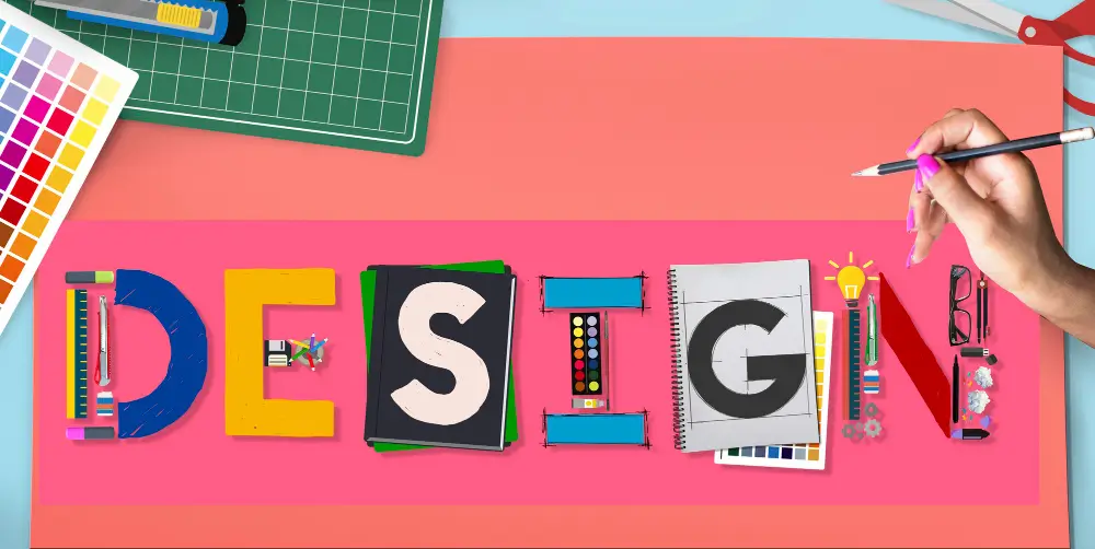
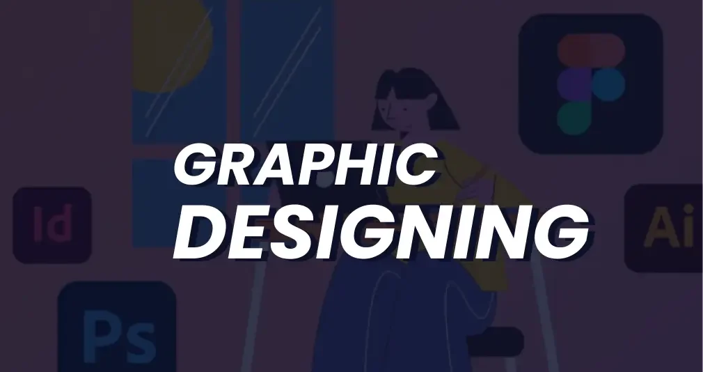
Designing Social Media Graphics

Introduction: Designing social media graphics is a powerful way to capture attention and convey messages quickly in today’s fast-scrolling digital world. With millions of posts shared daily, eye-catching visuals can make your content stand out and drive engagement. Whether you’re promoting a product, sharing a quote, or telling a story, well-designed graphics help reinforce your brand identity. Each platform has unique dimensions and audience behavior, making customization essential. Effective design combines creativity with strategy, ensuring your message is both appealing and clear. Consistency in style, color, and typography builds recognition and trust. In short, great graphics make your content memorable and impactful. Why Social Media Graphics Matter: Visual content has proven to drive more engagement than text alone. According to studies: Social media graphics help with: In short, strong visuals = stronger communication. Understanding Your Goals and Audience: Identifying your objectives and knowing your audience lays the groundwork for impactful and strategic social media graphic design. It helps you create content that aligns with your purpose—whether it’s boosting engagement, driving sales, or increasing brand awareness. Knowing your audience’s preferences, interests, and behaviors allows you to tailor visuals that truly resonate. Clear goals guide your design choices, from color schemes to messaging tone. Without this clarity, even the best designs may miss the mark. Ask yourself: Understanding this helps you choose the right tone, colors, fonts, and imagery. Platform-Specific Design Tips: Each social media platform has different content styles, formats, and user behavior. Let’s break it down: 1. Instagram: 2. Facebook: 3. Twitter/X: 4. LinkedIn: 5. Pinterest: Design Principles to Follow: Creating social media graphics isn’t just about adding text over an image. Here are core principles every designer should follow: 1. Hierarchy: Arrange design elements strategically to lead the viewer’s focus—leverage scale, color contrast, and spacing to highlight important details. 2. Balance and Alignment: Maintain symmetry or asymmetrical balance depending on the vibe. Use grid systems to align elements cleanly. 3. Contrast: Contrast makes text readable and helps elements pop. Light text on dark backgrounds (or vice versa) increases impact. 4. Consistency: Use consistent fonts, colors, and design styles to maintain brand identity across all platforms. 5. Whitespace: Don’t clutter. Whitespace (empty space) allows the design to breathe and improves focus. Choosing the Right Tools: No matter your experience—pro designer or just starting out—there are design tools available to match every level of expertise. Beginner-Friendly Tools: Canva – Drag-and-drop templates, ideal for non-designers.Adobe Express – Lightweight tool for quick social posts.Crello (VistaCreate) – Rich template library and animation support. Professional Tools: Adobe Photoshop – Offers precise, professional-level control over each aspect of your design work.Adobe Illustrator – Great for vector-based social media icons and graphics.Figma – Collaborative design, perfect for teams and UI-heavy content. Tips for Crafting Engaging Social Graphics: 1. Use Brand Colors and Fonts: Ensure your visuals are easily identifiable by using your established color scheme and fonts—this strengthens brand recognition and builds audience trust. 2. Limit Fonts to Two: Using too many fonts creates visual confusion. A primary font for headlines and a secondary one for body text is sufficient. 3. Use High-Quality Images: Avoid pixelated, low-res visuals. Use stock libraries like Pexels, Unsplash, or premium options like Shutterstock for crisp images. 4. Add Your Logo Strategically: Watermark your content without being distracting. A small logo in a corner works well. 5. Incorporate CTAs: Add subtle Call-To-Actions like “Swipe Up,” “Tap to Learn More,” or “Save This Post” to guide your audience. Trends to Watch in 2025: Social media design is always evolving. Staying ahead of the curve keeps your content fresh and competitive. Kinetic Typography: Animated text adds movement and excitement to your graphics, ideal for reels and stories. 3D and Isometric Designs: Give your posts a modern edge with depth and dimension. Bold Gradients & Color Duos: Vibrant color transitions are back, especially for tech and lifestyle brands. Collage-Style Layouts: Mixing textures, cut-outs, and photography gives a creative edge, especially on Instagram. Dark Mode Friendly Designs: Designing graphics that look great in both light and dark modes ensures they’re device-adaptive. Optimizing for Engagement: Design is only part of the puzzle—distribution and strategy matter too. Also, always schedule posts during peak engagement times and repurpose graphics across platforms (with appropriate resizing). Common Mistakes to Avoid: Even seasoned designers slip into these traps: Fixing these mistakes ensures your content is polished, professional, and effective. Conclusion: Designing compelling social media graphics is both an art and a science. With the right tools, strategy, and creativity, you can craft visuals that not only stop the scroll but also drive real engagement. Remember, each graphic is a visual representation of your brand’s story. Make it count. Whether you’re a business owner, marketer, or designer, investing time in mastering social design will amplify your brand’s voice across the digital landscape. Also Read: Smart Objects and Filters in Photoshop
Creative Text Design Techniques
Introduction: In graphic design, text is not just a means of communication—it’s a powerful visual tool. Creative text design techniques help transform ordinary words into eye-catching elements that enhance the overall aesthetic of a project. Whether it’s a bold headline, a subtle caption, or an animated quote, the way text is styled can significantly influence user engagement. From custom typography to clipping masks and motion effects, these techniques allow designers to add personality and emotion to their work. Text can be playful, professional, dramatic, or minimal—depending on how it’s treated. Mastering these techniques is crucial for crafting impactful and visually engaging messages through design. Let’s explore the top techniques that make text both functional and artistic in design. 1. Use of Custom Typography: One of the best ways to make your text stand out is by using or creating custom typography. While default fonts serve functional purposes, custom typography adds personality and originality. Designers often hand-letter or digitally illustrate typefaces to give a brand or project a unique flair. Tip: You can use software like Adobe Illustrator, Procreate, or Fontself to create and refine your custom fonts. 2. Text Masking and Clipping Techniques: Text masking is a popular technique where an image, texture, or video is placed within the fill of the text. This method is especially effective for dynamic titles, travel posters, and event promotions. How to Do It: Using Photoshop or Illustrator, position the image layer directly on top of the text layer to begin the effect.Simply right-click on the image layer and choose the “Clipping Mask” option to embed it within the text. This embeds the image within the shape of the text, creating a vibrant, layered effect. 3. Gradient and Duotone Text Effects: Flat colors are great, but gradients can bring text to life. Gradient text gives a sense of depth, movement, and mood. Meanwhile, duotone effects apply two contrasting colors to a grayscale image or type, often used in modern magazine or music cover designs. Tools: 4. 3D and Isometric Text: Adding a 3D touch to text gives it dimension and makes it pop. You can either go the digital route using software like Blender or Cinema 4D, or apply faux-3D effects in Photoshop using layer styles like Bevel & Emboss, or by duplicating and offsetting layers. Isometric text, on the other hand, provides a geometric, technical look that’s great for infographics and futuristic designs. 5. Negative Space Typography: Negative space, or white space, refers to the empty area around or within text. Using negative space creatively can result in smart, visually impactful designs that communicate double meanings or hidden messages. Example: The FedEx logo cleverly hides an arrow between the “E” and “x”, showing speed and precision. 6. Kinetic Typography (Animated Text): Kinetic typography is the art of bringing text to life through motion in videos or animations. Ideal for promos, presentations, and social media, it adds energy and engagement. Designers can animate text to move, shift, rotate, fade, or scale in rhythm with audio or narration, creating a dynamic visual experience. Tools: 7. Layering Text Over Shapes and Photos: Overlaying text on images or geometric shapes creates contrast and improves readability while still keeping the design visually engaging. This is widely used in social media banners and UI headers. Tips: 8. Distorted and Warped Text: Warping allows you to twist, curve, or shape text into dynamic forms. This technique is useful in logos, album covers, or streetwear designs where a strong visual statement is required. Tools: 9. Text as a Design Element (Typographic Layouts): Instead of placing text simply as content, consider building an entire composition using typography. This method is known as typographic layout where type becomes both message and structure. Techniques: 10. Experimental Fonts and Pairing: Breaking the rules can lead to exciting results. Try pairing a bold display font with a minimal sans-serif for contrast. Or combine serif and script fonts to balance tradition and personality. Font Pairing Ideas: Use platforms like Google Fonts, Fontpair.co, or Adobe Fonts to explore reliable combinations. 11. Text with Motion Blur or Glitch Effects: Give your text a futuristic or digital vibe using glitch or motion blur effects. These are especially appealing for tech events, gaming posters, and cyberpunk-style themes. How to Create: 12. Interactive Text for Web Design: In modern web design, interactive text effects can enhance user engagement. Whether it’s hover effects, scroll animations, or dynamic content, interactive text helps guide the user’s attention and boosts conversion. Use: Best Practices for Creative Text Design: Regardless of the technique, consider these principles: Readability is Key: While creative design is important, it should never compromise readability—always evaluate font size, spacing, and color contrast for clarity. Consistency in Style: If you’re mixing fonts or effects, ensure consistency with your brand’s tone and design system. Hierarchy Matters: Use size, color, and weight to prioritize important messages. Balance and White Space: Don’t overcrowd your canvas. Space helps the text breathe and improves focus. Responsive Thinking: Always design with multiple screen sizes and devices in mind—especially for digital and web applications. Conclusion: Creative text design is more than just aesthetics—it’s about strategic visual storytelling. With techniques like custom typography, clipping masks, kinetic text, and smart font pairing, you can bring emotion, energy, and clarity to your designs. As a designer, constantly challenge yourself to think beyond just words—think of letters as shapes, voices, and visual instruments. Explore, experiment, and most importantly, keep practicing. Ready to bring your typography to life? Open up your design tool of choice and try out one of these techniques today! Also Read: Designing Social Media Graphics
Using Masks and Adjustments

Introduction: In the realm of graphic design, precision and flexibility are key. Whether you’re creating marketing materials, editing photos, or designing digital art, you need tools that allow you to make non-destructive changes and detailed edits. That’s where masks and adjustments layers and masks truly prove their value. These two powerful tools—often underutilized by beginners—can elevate your designs by allowing controlled, reversible, and highly flexible changes to your work. This comprehensive guide explores how to effectively use masks and adjustments in graphic designing, mainly focusing on tools like Adobe Photoshop, but the principles also apply across platforms like Affinity Photo, GIMP, and others. What Are Masks in Graphic Designing? At its core, a mask allows you to show or conceal areas of a layer non-destructively, preserving the original image data. Think of it like putting a stencil over an image—what you see through the stencil remains visible, and the rest is hidden. Types of Masks: 1. Layer Mask: 2. Clipping Mask: Why Use Masks? Non-Destructive Editing: Unlike erasing, using masks lets you hide content without permanently deleting it. Fine Control: You can blend images, apply selective adjustments, or highlight specific areas with precision. Editable Anytime: You can modify masks anytime in your workflow. Smooth Transitions: Create seamless effects using gradients or soft brushes on masks. How to Use Layer Masks in Photoshop (Step-by-Step): 1. Select the Layer: Choose the layer you want to apply a mask to. 2. Click ‘Add Layer Mask’ Button: This is found at the bottom of the Layers panel. A white preview box appears beside your layer, representing the newly added mask. 3. Choose a Brush Tool: Use a soft, round brush for smooth effects. 4. Set Foreground to Black: Painting black on the mask hides the layer’s content. 5. Paint Over Areas to Hide: You’ll notice those parts become transparent or reveal what’s underneath. 6. Use White to Reveal: Switch back to white to unmask or bring back hidden parts. Advanced Masking Techniques: 1. Gradient Masking: 2. Using Selections with Masks: 3. Invert the Mask: Adjustment Layers: The Power of Global and Local Edits: Adjustment layers allow you to apply effects like brightness, contrast, hue/saturation, levels, curves, and more—without altering the original image. Each adjustment layer comes with its own mask by default, allowing targeted edits with precision. Common Adjustment Layers: Brightness/Contrast: Enhances or dims your image with just two sliders. Great for quick fixes. Levels: Adjust the shadows, midtones, and highlights. Ideal for correcting exposure. Curves: Offers more refined tonal control compared to Levels. Hue/Saturation: Change specific colors in your design or desaturate an image for a grayscale effect. Color Balance: Adjust the balance between colors (cyan-red, magenta-green, yellow-blue) in shadows, midtones, and highlights. Using Adjustment Layers Effectively: 1. Add Adjustment Layer: To insert an adjustment layer, navigate to Layer > New Adjustment Layer or tap the half-shaded circle icon in the Layers panel. 2. Edit Properties: Each adjustment layer comes with properties you can tweak to achieve your desired effect. 3. Use the Built-in Mask: Just like a regular mask, use black, white, and gray to control where the adjustment appears. 4. Clip to a Specific Layer: To apply an adjustment only to the layer directly below, right-click the adjustment and select ‘Create Clipping Mask’. Combining Masks with Adjustments for Stunning Effects: The real magic happens when you combine masks with adjustments. For example: Selective Color Correction: Target the sky in a landscape shot by pairing a Hue/Saturation adjustment with a mask for precise color correction. Light and Shadow Enhancement: Apply Curves and mask to emphasize lighting on certain parts of a portrait. Vignetting: To produce a vignette effect, apply Levels or Curves alongside a radial gradient mask for subtle edge darkening. Practical Applications in Graphic Designing 1. Compositing and Image Blending: Use masks to blend multiple photos into a single cohesive composition—ideal for advertising or photo manipulations. 2. Highlighting Product Features: Apply an adjustment layer with a mask to draw attention to specific parts of a product in promotional graphics. 3. Creative Photo Editing: Turn photos into works of art by selectively enhancing areas using masks combined with adjustments like Color Balance and Curves. 4. Typography Effects: Use clipping masks to embed textures, gradients, or images within text, and enhance the effect with adjustment layers for custom color grading. Tips for Working with Masks and Adjustments: Name Your Layers and Masks: Helps keep your workspace organized, especially in complex designs. Use Feathering: Add feather to your mask edges for smoother transitions. Use Smart Objects: Convert layers to Smart Objects before masking, so you can preserve resolution and edit later. Zoom In When Detailing: High zoom helps while brushing masks on intricate designs or small areas. Combine with Blend Modes: Masks + adjustments + blending modes can create dynamic visual effects. Common Mistakes to Avoid: Forgetting to Select the Mask Thumbnail: Always click the mask thumbnail before painting, or you might accidentally paint on the image layer itself. Using 100% Hardness Brushes for Soft Transitions: Use soft-edge brushes for smoother and more natural blending. Overdoing Adjustments: Avoid extreme settings on adjustment layers unless you’re going for a specific stylized effect. Not Checking the Layer Stack: The order of adjustment layers and masks matters. Always double-check the stacking for the intended outcome. Conclusion: Mastering masks and adjustment layers is essential for every graphic designer. These tools allow you to work non-destructively, with more freedom to experiment, and with the precision needed for professional-level output. Once you integrate these into your everyday workflow, you’ll find your editing capabilities more refined, your compositions more compelling, and your design process significantly more flexible. As you continue to explore and practice, challenge yourself to use masks and adjustments not just for corrections—but also as creative tools for storytelling and emotional impact. The more you play, the more powerful your designs will become. Also Read: Creative Text Design Techniques
Making Simple Selections Easily

Introduction: Making precise selections is one of the most essential skills in photo editing and graphic design. Whether you’re isolating a subject, changing a background, or applying effects, clean selections set the foundation. Thankfully, modern tools like Photoshop make this process much easier—even for beginners. From basic shapes to complex edges, there’s a tool for every type of selection. Selecting the appropriate tool for each task boosts efficiency and enhances the overall quality of your edits. In this guide, we’ll explore simple and effective methods for making selections with ease. No stress, no guesswork—just smart, clean editing. Why Selections Matter: Before diving into the techniques, let’s quickly understand why making selections is such an important skill. Selections allow you to: Mastering selections will dramatically improve your efficiency and precision when editing. 1. The Marquee Tools – Perfect for Basic Shapes: The Marquee Tools are the most straightforward way to make selections. These are ideal for selecting rectangular or elliptical areas. How to Use: Best For: It’s simple, fast, and perfect for images that have clearly defined geometric areas. 2. The Lasso Tools – Freeform Flexibility: When your selection doesn’t follow a standard shape, tools like the Lasso, Polygonal Lasso, and Magnetic Lasso offer flexible solutions. Regular Lasso: Magnetic Lasso: Quick Tip: 3. The Quick Selection Tool – Smart and Intuitive: The Quick Selection Tool (W) is a favorite among beginners and pros alike. It intelligently detects edges based on color and texture similarity. How to Use: Why It’s Great: For fast results with minimum effort, this tool is hard to beat. 4. Magic Wand Tool – One Click Wonders: When dealing with uniform color regions, the Magic Wand Tool proves highly effective for quick and easy selections. How It Works: Pro Tip: Lower tolerance for precise areas; higher tolerance for broader ranges. Perfect for selecting skies, solid backgrounds, or monochrome items. 5. Select Subject – Powered by Adobe Sensei: Recent versions of Photoshop feature an AI-driven tool called Select Subject. It automatically identifies the main subject in your image. How to Use: It’s incredibly helpful for portraits, products, or any image with a clear focal point. 6. Select and Mask: Refine Selections Precisely: Once you’ve made a selection, chances are it needs a bit of tweaking. That’s where Select and Mask comes in. How to Use: Best Practices: This panel is essential when working with hair, fur, or semi-transparent objects like veils or smoke. 7. Color Range – Targeting Specific Tones: If you’re working with images that have vibrant and contrasting colors, Color Range can be your best friend. Steps: This technique is useful for isolating colored backgrounds, replacing skies, or emphasizing a specific color theme. 8. Tips for Easier Selections: Even with powerful tools, good technique can make or break your selection process. Here are some golden rules: Zoom In and Out: Don’t rely on the default view. Zoom Closer for Precision, Zoom Out to Check the Bigger Picture Use Layer Copies: Always work on a duplicate layer when experimenting. That way, your original image stays untouched. Combine Tools: Don’t hesitate to use multiple tools in a single workflow. For example, use Quick Selection first, then refine with Lasso or Select and Mask. Use Add/Subtract Modes: Hold Shift to add to a selection, and Alt (Option) to subtract. This keeps your work flexible and non-destructive. 9. Practice Projects to Improve Selection Skills: To truly master selections, practice with real images. Here are a few beginner-friendly projects: Cut Out a Subject: Remove the background from a portrait. Change Background Color: Quickly modify background colors by using the Magic Wand tool alongside fill layers. Color Pop Effect: Select one object and desaturate everything else. Text Clipping Mask: Select a part of an image to fit inside text shapes. Hands-on experience will build confidence and sharpen your accuracy. 10. Common Mistakes to Avoid: Beginners often fall into these traps when making selections: Over-Feathering: Applying too much feathering results in overly soft edges and diminished detail. Ignoring Refinement: A rough selection may look acceptable on a small scale but falls apart on larger screens or prints. Not Zooming In: Precision is key, especially around curves and hair. Relying on One Tool: Each tool has strengths. Combining them gives you far better control. Conclusion: Making simple selections doesn’t have to be overwhelming. With a solid grasp of Photoshop’s selection tools and some regular practice, anyone can isolate, cut out, or modify image areas quickly and efficiently. Whether you’re a digital artist, photographer, or content creator, learning how to make clean, controlled selections will supercharge your creative projects. Also Read: Using Masks and Adjustments
Basic Photo Editing Techniques
Introduction: In the digital world of today, visuals are everything. Whether you’re designing a marketing banner, social media post, website layout, or product packaging, high-quality edited images are essential to creating professional and impactful designs. As a graphic designer, knowing how to apply basic photo editing techniques gives you the creative control to bring ideas to life. This blog post explores the most important and widely used basic photo editing techniques every aspiring graphic designer must master. No matter what software you use — Adobe Photoshop, Lightroom, GIMP, or Canva — these techniques form the foundation of digital design. 1. Cropping and Straightening: One of the most basic, yet powerful tools in any photo editing software is the Crop Tool. Cropping allows you to: Pair this with straightening, and you can correct tilted images — particularly useful for architecture, horizon shots, or product photos that should appear perfectly aligned. Pro Tip: Use the Rule of Thirds grid while cropping to achieve better visual balance. 2. Adjusting Brightness and Contrast: Brightness affects the overall lightness or darkness of an image, while contrast determines the difference between the lightest and darkest areas. Fine-tuning these settings helps to ensure that your images look clean, vivid, and professionally lit. Avoid extremes to prevent losing details. 3. Color Correction and White Balance: Correct color tones are critical in design. Often, raw images may appear too cool (blue) or too warm (yellow). This is where white balance correction comes into play. Use tools like: These help to: 4. Saturation and Vibrance Control: Saturation adjusts the intensity of all colors in an image. Over-saturation can make photos look artificial, while under-saturation makes them dull. Vibrance is a more selective tool — it increases the intensity of less-saturated colors without overdoing already bright areas. It’s ideal for portraits or lifestyle images. Graphic design tip: Use vibrance for subtle improvement; saturation when you want to make colors pop boldly. 5. Sharpening and Clarity: Images often lose sharpness when resized or compressed for web. Adding sharpening can restore detail and make textures more prominent. Caution: Over-sharpening can cause unwanted noise or halo effects. Apply it selectively. 6. Removing Blemishes or Unwanted Objects: Whether it’s a skin blemish, dust particle, or background distraction, removing imperfections is essential. Use: This technique is particularly useful in product photos, real estate images, and portraits. Clean backgrounds and surfaces make your design look polished. 7. Using Filters and Presets: Filters and presets provide a quick and consistent way to stylize photos. In software like Lightroom or Canva: While they’re great time-savers, it’s important to adjust them based on your image’s specific lighting and tones. Avoid using default filters without tweaks. 8. Resizing and Resolution Settings: Grasping image resolution is essential when optimizing visuals for various platforms and display formats. Graphic designers should always ensure that images look crisp across all screen sizes and mediums. 9. Layer-Based Editing: For non-destructive editing, especially in Photoshop or Affinity Photo, use layers: This gives you flexibility to revise, hide, or tweak changes without starting over — a must for professional design work. 10. Blurring and Depth of Field: Adding a subtle background blur can help your subject stand out, especially in promotional or portfolio images. Use tools like: You can simulate depth of field effects often seen in DSLR photography. This gives your image a more cinematic or premium look. 11. Text Overlay and Typography: For social media or advertisement graphics, adding text is often necessary. Ensure your typography: Keep contrast in mind — light text over dark backgrounds, or vice versa. Use shadows or outlines for added visibility. Design Hack: Apply slight blur or gradient under the text area for better readability without damaging the original photo. 12. Saving in the Right Format: Finally, knowing which format to save your edited photo in is important: JPEG – JPEG is ideal for everyday use, offering a balance between image quality and compact file size.PNG – For images with transparency.TIFF – High-quality format for printing.PSD – Editable Photoshop file with layers intact. Always keep a master copy before flattening or compressing your work. Conclusion: Mastering these basic photo editing techniques is the first step in your journey as a graphic designer. Clean, well-edited photos enhance your overall design quality, improve client satisfaction, and establish a professional brand image. Don’t rush the process. With practice and a keen eye for detail, even simple adjustments can transform a plain photo into a stunning visual element in your design project. Also Read: Making Simple Selections Easily
Working with Layers Basics

Introduction: Graphic design is a fusion of creativity and structure. Whether you’re designing a poster, editing a photo, or crafting a logo, understanding how to working with layers basics is fundamental to your success. Layers are the backbone of most modern graphic design software, offering a non-destructive and highly organized approach to creating complex visuals. In this blog post, we’ll explore the basics of layers in graphic design: what they are, why they matter, and how to work with them efficiently. Whether you’re using Adobe Photoshop, Illustrator, GIMP, or any other design tool, these concepts remain consistent and critical. What Are Layers? Think of layers as transparent sheets stacked on top of each other. Each layer contains individual elements of your design—text, images, shapes, or effects—that you can manipulate independently without affecting the rest of the composition. Layers allow you to: For instance, in a simple poster design, you might have separate layers for: Without layers, all these elements would be stuck together on one canvas, making edits extremely difficult. Types of Layers: Depending on the software you’re using, there are different types of layers you might encounter: Raster Layers: These are pixel-based layers used in software like Photoshop. You can paint, erase, or apply filters on them. Raster layers are great for photo editing and digital painting. Vector Layers: Used in tools like Adobe Illustrator, vector layers are resolution-independent, meaning they can be scaled without losing quality. They’re perfect for logos, icons, and typography. Adjustment Layers: These layers apply effects (like brightness, contrast, hue, saturation) without altering the original image. You can adjust or delete them anytime, preserving the original content. Text Layers: These contain editable text. You can change the font, size, color, and effects without converting the text into pixels or outlines. Shape Layers: Shape layers hold geometric forms created using the shape tools. They can be filled with color, patterns, or gradients and remain editable. Why Layers Are Important in Design: 1. Organized Workflow: Layers keep your design clean and structured. You can name them, group them, and reorder them for clarity, especially on complex projects. 2. Non-Destructive Editing: With layers, you don’t have to worry about damaging your original image or elements. You can edit and experiment freely. 3. Easier Revisions: Clients often request changes. Layers make it simple to tweak just one part of the design without redoing the entire thing. 4. Flexible Design Process: You can hide, lock, or duplicate layers to test variations or isolate certain design elements. Layer Panel Basics: The Layers panel acts as your command hub for organizing and controlling every element in your design. Though each design software has a slightly different layout, most panels allow you to: Mastering the Layer Panel helps speed up your workflow and avoid mistakes. Layer Hierarchy and Stacking Order: Layers are arranged in a vertical order, where elements placed higher in the stack visually appear above those positioned beneath them. For example: Understanding stacking order is essential when creating depth or placing elements strategically in a layout. Blending Modes: Blending modes determine the visual interaction between a layer and those lying underneath it. These are especially useful for creating lighting effects, textures, and color adjustments. Common blending modes include: Layer Masks: Using layer masks, you can control which parts of a layer are visible or hidden without changing the original image. Black conceals, white reveals—allowing for detailed, non-permanent adjustments to your design. Why use masks? Layer masks are essential for compositing images or creating soft transitions. Adjustment Layers: Adjustment layers sit on top of your existing layers and apply image-wide edits. Common adjustments include: Because they’re separate from the image itself, you can turn them off, change them, or move them around freely. Layer Styles and Effects: Layer styles add visual enhancements like: These are accessible via a double-click on the layer (in Photoshop) or through dedicated menus in other programs. They update in real time and are fully editable. Naming and Grouping Layers: As your design grows, managing layers becomes critical. Use these best practices: Name Your Layers: Avoid default names like “Layer 1” or “Copy 2.” Use descriptive names like “Header Text” or “Logo Icon.” Group Related Layers: Combine related layers into folders or groups (e.g., all text elements, background assets). This helps you collapse and expand groups to navigate your project faster. Color Code Layers (if available): In some software, like Photoshop, you can assign color labels to layers for visual organization. Tips for Efficient Layer Use: Use Shortcuts: Learn keyboard shortcuts for creating, duplicating, locking, and selecting layers. Don’t Flatten Unless Necessary: Keep layers intact for flexibility. Flattening is permanent. Use Smart Objects for Reuse: Convert elements into Smart Objects when reusing graphics across multiple layers or projects. Keep a Clean File: Delete unused or hidden layers before final delivery. It reduces file size and keeps your design clean. Back Up Your File: Save versions or duplicates in case you need to revert to a previous state. Conclusion: Mastering layers is a core skill for every graphic designer. They give you creative control, flexibility, and organization, allowing your design process to be smoother and more professional. Whether you’re just starting out or building a long-term career in design, understanding how to work with layers will save you time, reduce mistakes, and improve the quality of your final work. As you continue your journey in graphic design, challenge yourself to explore deeper aspects of layer use—like advanced masking, smart objects, and dynamic effects. Layers aren’t just a feature—they’re the framework that supports your creativity. Also Read: Basic Photo Editing Techniques
Photoshop Interface and Tools
Introduction: Adobe Photoshop is widely recognized as the premier software choice in the graphic design industry. Whether you’re editing photos, creating digital artwork, or designing web assets, Photoshop offers an extensive toolkit that empowers creativity. At the heart of this powerful software lies its interface and tools — the foundation upon which every graphic designer builds their projects. In this comprehensive guide, we’ll explore the Photoshop interface and the essential tools every graphic designer should know. Whether you’re a beginner or looking to sharpen your skills, understanding the layout and function of Photoshop’s core tools can significantly enhance your workflow and creative output. 1. Understanding the Photoshop Interface: It’s essential to get acquainted with Photoshop’s interface before exploring its vast array of tools. Adobe has crafted an intuitive workspace that balances customization with functionality. The Menu Bar: Positioned at the top of the screen, the Menu Bar features sections such as File, Edit, Image, Layer, Select, Filter, View, Window, and Help—each housing a collection of relevant tools and functions. The Options Bar: Situated beneath the menu bar, the Options Bar dynamically updates based on the currently selected tool, presenting settings such as size, opacity, alignment, and style tailored to that specific tool. The Tools Panel: This vertical bar on the left side of the screen holds all your tools — from selection and painting to text and navigation. Understanding each tool’s function is key to mastering Photoshop. The Document Window: This is your actual canvas — where you create and edit images. Multiple documents can be opened simultaneously in separate tabs. Panels and Palettes: To the right of the interface, you’ll find collapsible panels such as Layers, Adjustments, Properties, Color, Swatches, and more. These panels help you manage layers, modify elements, and apply effects. 2. Essential Photoshop Tools for Graphic Designers: Now let’s explore the core Photoshop tools that are crucial for any graphic design project. 1) Selection Tools: Selection tools allow designers to isolate parts of an image or design for editing. 2) Crop and Slice Tools: These tools help trim or divide images efficiently. 3) Retouching and Healing Tools: Used to enhance or correct images by removing flaws. 4) Painting Tools: Used for digital painting and color application. 5) Drawing and Shape Tools: Crucial for vector-based design and layout. 6) Type Tools: Text is an essential element in most graphic designs. 7) Navigation Tools: These help you zoom and move around your canvas. 3. Layers and Layer Management: Layers are the backbone of non-destructive editing in Photoshop. Every new element, whether it’s text, shape, or brush stroke, can exist on its own layer. Types of Layers: Layer Features: Effective layer management — using groups, naming conventions, and color coding — is vital for large or complex projects. 4. Advanced Features for Designers: While the basics cover most needs, Photoshop also includes advanced tools for more creative freedom: 5. Tips for Working Efficiently in Photoshop: Learn Keyboard Shortcuts: Memorizing shortcuts can drastically speed up your workflow. Conclusion: Mastering the Photoshop interface and tools is essential for anyone pursuing a career in graphic design. With its rich feature set and limitless potential, Photoshop enables designers to bring their visions to life — whether that means crafting a sleek logo, retouching a photo, or building a multi-layered digital composition. While the learning curve may seem steep at first, consistent practice and exploration will help you unlock the full power of Photoshop. As you grow more comfortable with its interface and tools, you’ll discover that Photoshop isn’t just software — it’s a creative companion. Also Read: Working with Layers Basics
Getting Started with Adobe Photoshop
Introduction: When you think about graphic design, one name stands out above the rest: Adobe Photoshop. This powerhouse software has become the industry standard for image editing, graphic creation, and digital artistry. Whether you’re an aspiring designer or simply looking to enhance your visual content skills, learning Photoshop is a foundational step. In this blog post, we’ll walk you through everything you need to know to get started with Photoshop in graphic designing—from installation and interface basics to essential tools and beginner tips. What is Adobe Photoshop? Adobe Photoshop, created by Adobe Inc., is a powerful raster-based image editor widely used for photo retouching, digital art creation, and crafting visual designs for both print and online media. Its versatility makes it a must-have tool for professionals in photography, graphic design, web design, marketing, and even 3D modeling. Why Use Photoshop for Graphic Designing? Photoshop serves as a versatile tool for graphic designers, helping them perform a wide range of creative tasks such as: Its flexibility, wide range of features, and compatibility with other Adobe Creative Cloud apps make it an essential tool in any designer’s toolkit. Step 1: Installing Photoshop: To begin, you need to have Adobe Photoshop installed on your computer. Pro Tip: You can test out Photoshop’s capabilities with a 7-day free trial from Adobe before deciding on a subscription. Step 2: Familiarizing Yourself with the Interface: Once installed, launch Photoshop and you’ll be greeted with a somewhat intimidating interface. But don’t worry—here are the core elements you need to understand: Spend some time clicking around and observing how different tools and panels interact. Step 3: Understanding Layers: Layers are like sheets of transparent paper stacked on top of each other. Each element of your design (text, images, shapes) should ideally be on a separate layer. This gives you more control and flexibility during editing. Layer Tips: Step 4: Learning Basic Tools: Let’s take a look at some fundamental tools that every newcomer to Photoshop should get familiar with: Get comfortable using these tools—they form the backbone of most graphic design tasks. Step 5: Starting Your First Project: Let’s create a simple social media graphic: 1. Create a New Document: 2. Add a Background: 3. Insert Text: 4. Add Shapes or Icons: 5. Save Your Work: Step 6: Exploring Essential Features: Photoshop is packed with features. Here are a few that are especially useful for beginners: Step 7: Practice, Practice, Practice: The best way to improve your Photoshop skills is to practice consistently. Here are some beginner project ideas: You can find endless free tutorials on YouTube, along with creative inspiration on platforms such as Behance and Dribbble. Bonus Tips for Photoshop Beginners: Take advantage of keyboard shortcuts to significantly boost your efficiency while working. For example, Ctrl+Z (Undo), Ctrl+T (Transform), and Ctrl+S (Save). Conclusion: Getting started with Photoshop in graphic designing may seem overwhelming at first, but with patience and practice, it becomes an incredibly rewarding skill. Whether you’re aiming to become a professional designer or simply want to improve your personal branding, Photoshop opens up a world of creative possibilities. Remember, even the best designers started where you are now—curious, a little confused, and eager to create. So open up Photoshop, dive in, and let your creativity lead the way. Also Read: Photoshop Interface and Tools
Creative Futures in Graphic Design
Introduction: The landscape of graphic design is changing faster than ever before. As we navigate a world driven by digital innovation, shifting user behavior, and evolving creative tools, graphic designers are finding themselves at the intersection of art, technology, and communication. The concept of “creative futures” in graphic design speaks to more than just trends—it’s about the expanding possibilities and responsibilities that come with designing for the future. From immersive experiences and artificial intelligence to ethical design and personalization, the future of graphic design is both promising and complex. In this post, we’ll explore what lies ahead, the skills tomorrow’s designers will need, and how creativity continues to shape the digital world. The Evolution of Graphic Design: Graphic design has long served as a visual language for storytelling and branding. Traditionally associated with print materials—like posters, brochures, and advertisements—the field has undergone a digital transformation over the last two decades. Today, graphic design spans web interfaces, mobile apps, motion graphics, virtual reality, and even interactive installations. This evolution is driven by changing consumer expectations, technological advancements, and the rise of platforms that require constant visual content. Design is no longer a static discipline; it’s dynamic, data-informed, and cross-functional. Designers must now think not only about aesthetics but also about usability, accessibility, performance, and experience. Key Forces Shaping the Future of Design: 1. Artificial Intelligence and Generative Design: Artificial intelligence stands as one of the most revolutionary influences reshaping the graphic design landscape today. Tools like Adobe Firefly, Midjourney, and DALL·E can generate images, templates, and even full layouts based on text prompts. These platforms are empowering designers to ideate faster, experiment more, and offload time-consuming tasks. Generative design, where machines assist or collaborate in the creative process, allows for more efficient workflows and endless variations. In the creative future, designers won’t just create visuals—they’ll curate, guide, and refine them with the help of intelligent systems. 2. Immersive Design: AR, VR, and Beyond: The next wave of design will be immersive. Augmented Reality (AR) and Virtual Reality (VR) are opening up three-dimensional spaces for graphic expression. From interactive product demos and virtual galleries to AR-enhanced ads and games, immersive design is transforming how users experience content. Graphic designers will need to think in terms of depth, movement, and user interaction. This requires learning new tools and collaborating closely with developers, 3D artists, and experience designers. The future creative professional may very well be part-designer, part-architect, part-storyteller. 3. Sustainability and Ethical Design: As global awareness of climate change and social inequality grows, so does the demand for sustainable and ethical design practices. This means more than just using recycled paper or eco-friendly fonts. In a digital context, it includes: The future of graphic design includes being responsible stewards of digital space—ensuring that visuals not only look good but also do good. 4. Personalization and Data-Driven Design: We live in an age of personalization. From streaming platforms to e-commerce websites, users expect content that is tailored to their preferences and behaviors. Graphic design must keep pace by becoming more adaptive and data-informed. Design frameworks built on reusable components pave the way for efficient and scalable personalization. Combined with user data, they enable designers to create visuals that change depending on context, location, device, or behavior. This shift makes understanding analytics, user testing, and dynamic content crucial for the designers of tomorrow. 5. Cross-Platform Visual Consistency: With the proliferation of screens and devices—phones, tablets, smartwatches, desktops, and even digital billboards—ensuring visual consistency has become a major design challenge. Brands need to maintain a cohesive identity across a fragmented digital ecosystem. Responsive design is no longer optional. Graphic designers must build flexible, scalable systems that adapt beautifully across platforms. This includes working within component libraries, design systems like Material Design, and frameworks like Figma and Adobe XD. Future Skills Every Designer Will Need: As the discipline evolves, so too must the skillset of the modern graphic designer. Here are some of the most important abilities for the future: 1. UX/UI Design Expertise: A deep understanding of user behavior, flow, and interface dynamics is vital for impactful design. Graphic designers who can bridge the gap between visuals and functionality will have a competitive advantage. 2. Motion Graphics and Animation: As video content and animated interfaces grow in popularity, motion design becomes an essential tool for storytelling and user engagement. 3. 3D Design and Spatial Thinking: Especially with the rise of AR and VR, 3D skills are no longer just for architects or game developers. Designers who can think spatially and work with tools like Blender or Cinema 4D are in demand. 4. Coding Literacy: While designers don’t need to be developers, knowing the basics of HTML, CSS, and JavaScript can significantly enhance collaboration and execution. 5. AI and Tool Proficiency: Staying up to date with AI-assisted tools will allow designers to maximize efficiency and stay ahead of the curve. 6. Storytelling and Brand Thinking: Fundamentally, design remains a powerful medium for storytelling. Designers who can create emotionally resonant, brand-aligned narratives through visuals will always be valued. Human Creativity in the Age of Machines: A central concern in the creative future is the role of human designers in a world increasingly assisted by algorithms. Designs powered by AI can be efficient and visually accurate, but they miss the soul and subtle understanding only humans can provide. Human creativity remains essential—especially in areas like: Designers who can harness technology while maintaining a unique creative voice will thrive. Rather than being replaced by machines, they will lead the way in making them work smarter. Collaboration as the New Creativity: Collaboration is quickly becoming a defining element of the next wave in creative innovation. Graphic design is becoming more interdisciplinary. Designers now work with marketers, data analysts, developers, writers, and AI systems. Successful projects require seamless teamwork across departments and tools. As a result, interpersonal skills like effective communication, flexibility, and openness to feedback become equally vital alongside technical expertise. Tools like Figma and Notion are helping facilitate this
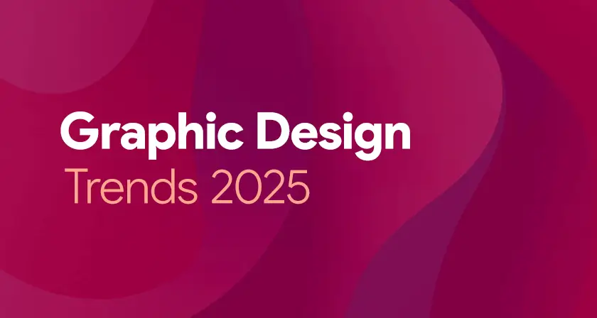
Top Graphic Design Trends in 2025
Introduction: Graphic design in 2025 is entering a bold new era, blending cutting-edge technology with timeless creativity. As brands and creators seek to stand out in an increasingly saturated digital world, design trends are shifting to reflect deeper cultural values and immersive experiences. From AI-generated visuals to nostalgic aesthetics, today’s design language is both innovative and emotionally resonant. Modern audiences crave authenticity, interactivity, and inclusivity—pushing designers to think beyond aesthetics. Motion, mixed media, and 3D elements are becoming standard tools of expression. Let’s explore the top graphic design trends shaping the visual landscape in 2025. 1. AI-Assisted Creativity: Artificial Intelligence has firmly established itself in the designer’s toolbox. While initially met with skepticism, in 2025 AI is embraced as a co-creator, offering ideation support, style inspiration, and automated generation of design drafts. How it’s used: Why it’s trending: The rise of AI-assisted tools empowers designers to push boundaries, reduce mundane work, and focus more on concept and storytelling. 2. Neo-Brutalism 2.0: Standing in stark contrast to polished minimalism, Neo-Brutalism 2.0 combines unapologetically bold visuals with a sleeker, more purposeful design structure. It embraces rigid lines, uncluttered backdrops, striking primary colors, and grid-based layouts—now reimagined with a cleaner, more contemporary finish. Features include: Use cases: Popular in portfolios, fashion brands, and startups that want to appear daring and unconventional. 3. Retro Futurism with a Modern Twist: 2025 sees a resurgence of retro-futurism—design inspired by how the past imagined the future. Think neon gradients, chrome textures, pixel art, and synthwave color palettes—reimagined with modern software capabilities. Where it appears: Why it’s relevant: Audiences are craving familiarity but still want novelty. Retro-futurism satisfies both, making it a favorite among Gen Z and millennials. 4. Kinetic Typography: Words in motion are becoming a central storytelling device. Kinetic typography adds emotional depth and rhythm to messages by animating words in engaging ways. Trends within this trend: Applications: Why it’s powerful: It combines function and flair—making text not only readable but also experiential. 5. Inclusive and Diverse Illustration Styles: Representation is no longer optional—it’s essential. Designers in 2025 are embracing a broader range of identities, cultures, body types, and neurodivergent perspectives in their work. Key elements: Impact: Inclusive visuals are becoming a design standard in advertising, education, healthcare, and corporate branding. 6. Surrealism & Dreamlike Aesthetics: 2025 design explores the subconscious, embracing dreamlike visuals and surreal compositions. The world is more chaotic, and consumers crave art that invites interpretation and reflection. Visual cues include: Why it resonates: Surrealism captures attention while allowing emotional nuance—ideal for editorial, fashion, and art-based campaigns. 7. Maximalism: More is More: Minimalism still holds its place, but maximalism is roaring back. In 2025, it’s not about restraint—it’s about creative explosion. Common features: Where it works: This style is perfect for brands that want to appear loud, joyful, or rebellious—especially in entertainment, food, or youth culture. 8. Sustainable and Eco-Inspired Design: Sustainability isn’t just a trend—it’s a movement. Designers are focusing more on eco-conscious messages, earthy aesthetics, and green-themed branding. Characteristics: Why it matters: Brands aligning with environmental values win loyalty from eco-conscious consumers. Design is playing a vital role in shaping that narrative. 9. 3D & Hyper-Realism: Thanks to better rendering engines and AR/VR growth, 3D design is thriving. Designers are pushing boundaries with hyper-real textures, lifelike lighting, and interactive visuals. Where you’ll see it: Bonus trend: 3D merged with flat graphics—giving a mixed-media, almost collage-like look that adds depth without complexity. 10. Variable Fonts and Experimental Typography: Typography in 2025 is playful, rebellious, and flexible. Designers are stepping away from safe font choices to explore more expressive typefaces. What’s in: Best for: Posters, branding, experimental websites, and anything looking to create visual intrigue. 11. Augmented Reality (AR) Integration: As AR technology becomes more accessible, graphic design is extending beyond the screen into real space. Interactive packaging, virtual try-ons, and AR filters are turning static design into immersive experiences. Examples: The takeaway: AR design is no longer futuristic—it’s here, and designers are learning to tell stories in new dimensions. 12. Muted Gradients and Soft Hues: The loud, hyper-saturated gradients of the early 2020s have faded into the background. In 2025, designers are embracing gentle, refined gradient tones that convey a sense of tranquility, sophistication, and well-being. Color directions: Where it shines: Perfect for wellness brands, SaaS platforms, and lifestyle publications looking for sophistication and calm. Conclusion: Graphic design in 2025 strikes an exciting balance between futuristic creativity and nostalgic inspiration, creating a visual language that feels both fresh and familiar. As boundaries blur between physical and digital, designers are challenged to create experiences that are visually engaging, emotionally resonant, and contextually relevant. Whether you’re embracing AI-powered workflows, diving into surreal art, or pushing typography to new heights—this year’s trends offer endless opportunities for experimentation and impact. If you’re a business or brand looking to stay ahead, now is the time to update your visual identity. Aligning with current trends—while maintaining authenticity—is key to standing out in today’s fast-paced digital landscape. Also Read: Creative Futures in Graphic Design