The Role of Typography in Web Design

Introduction: Have you ever visited a website and immediately felt at ease reading the content? Or maybe you’ve encountered a page where the text was so hard to read, you just clicked away? The difference between these two experiences often comes down to typography. Typography is more than just choosing pretty fonts; it’s a critical component of web design that can make or break a user’s experience. In this article, we’ll dive deep into the role of typography in web design, exploring why it’s so important and how to get it right. What Is Typography? Typography involves the skillful arrangement of text to ensure that written content is not only legible and easy to read but also visually pleasing. It’s about more than just choosing a font; it involves selecting typefaces, point sizes, line lengths, line-spacing (leading), letter-spacing (tracking), and adjusting the space between pairs of letters (kerning). Typography has been around for centuries, but its role in web design is relatively new, evolving with the rise of digital media and the internet. The Importance of Typography in Web Design: When it comes to web design, typography isn’t just about aesthetics; it’s a tool for communication. Good typography enhances readability, engages users, and helps to create a visual hierarchy that guides readers through your content. It’s also a powerful tool for establishing brand identity. A carefully chosen typeface can convey professionalism, creativity, or any number of brand attributes, making it an essential part of your web design strategy. Key Typography Elements in Web Design: Fonts and Typefaces: First things first: what’s the difference between a font and a typeface? In simple terms, a typeface is the design of the letters, while a font is a specific version of that typeface, like bold or italic. Popular typefaces in web design include serif fonts like Times New Roman and sans-serif fonts like Arial and Helvetica. These typefaces are chosen for their readability and versatility across different devices. Font Size and Scale: Font size is crucial for readability, especially on the web. Too small, and users strain their eyes; too large, and it can look unprofessional. A good rule of thumb is to keep your body text between 16px and 18px, adjusting for your audience and design context. Additionally, consider how your font scales across devices—what looks good on a desktop might be overwhelming on a mobile screen. Line Height and Spacing: Line height, or the space between lines of text, plays a significant role in legibility. Too little space, and the text feels cramped; too much, and it starts to feel disjointed. A line height of 1.5 times the font size is often recommended, but this can vary depending on the typeface and overall design. Color and Contrast: The color of your text and its contrast with the background can drastically affect readability. High contrast, like black text on a white background, is easiest to read. However, using colors that reflect your brand’s identity while maintaining readability is also important. Contrast is not just a design choice but an accessibility issue, ensuring that all users, including those with visual impairments, can read your content easily. Choosing the Right Typography for Your Website: Understanding Your Audience: Your audience should always be at the forefront when selecting typography. If your target audience is older, larger fonts and higher contrast might be necessary. For a younger, more trendy audience, you might opt for modern, stylish fonts that reflect current trends. Matching Typography with Brand Identity: It should be consistent across all your platforms, from your website to your social media to your printed materials. Brands like Apple, for instance, are known for their clean, minimalist typography, which aligns with their overall brand image of simplicity and innovation. Balancing Aesthetics and Functionality: While it’s tempting to choose trendy fonts that stand out, readability should always be your top priority. That doesn’t mean you can’t be creative—using multiple typefaces can add visual interest. However, combining too many different fonts can make your design look chaotic. Typography and User Experience (UX): Typography plays a huge role in user experience. It influences how users interact with your content, how long they stay on your page, and even how they perceive your brand. Good typography helps users navigate your site more easily, while poor typography can frustrate them, leading to higher bounce rates. For instance, using clear headings and subheadings makes it easier for users to skim your content and find the information they’re looking for. The Role of Typography in SEO: Did you know that typography can affect your website’s SEO? Search engines prioritize user experience, and part of that experience is how easily users can read and engage with your content. Readable typography can reduce bounce rates, keep users on your site longer, and even improve your site’s accessibility—all of which can positively impact your search rankings. Additionally, using web-safe fonts that load quickly and don’t disrupt the user experience can further enhance your SEO efforts. Typography Trends in Web Design: Typography trends are constantly evolving, influenced by changes in technology, user behavior, and design aesthetics. Some current trends include the use of bold, oversized fonts, which make a strong visual statement, and minimalist typefaces that emphasize simplicity and clarity. Variable fonts, which allow for more flexibility in design, are also gaining popularity. Staying updated with these trends can help keep your website looking fresh and modern. Also Read: How Web Development Helps Online Marketing
Improve Your Website’s UX: Simple Strategies for a Great User Experience

Introduction: In today’s digital landscape, having a website that looks good is just the beginning. User Experience (UX) has become a pivotal factor in the success of any online presence. A well-designed UX can increase engagement, boost conversions, and foster customer loyalty. Here, we’ll explore simple yet effective strategies to improve your website’s UX, making it not just user-friendly but user-delightful. Understanding User Experience (UX): Before diving into strategies, it’s essential to understand what UX entails. User Experience refers to how a person feels when interacting with a website or application. This encompasses everything from the design and usability to the overall impression the website leaves on its users. A positive UX leads to satisfied users who are more likely to return and recommend your site to others. 1. Simplify Navigation: Simplifying navigation is crucial for creating an intuitive user experience on your website. Clear, organized menus help users find what they’re looking for quickly and effortlessly. Limit the number of menu items to avoid overwhelming visitors and use descriptive labels for clarity. Incorporating a search bar can further assist users in locating specific content. Ultimately, streamlined navigation fosters a positive experience, encouraging users to explore your site more thoroughly. Here are some tips to simplify navigation: Clear Menu Structure: Ensure your main navigation is straightforward and intuitive. Keep the menu concise to prevent users from feeling overwhelmed. Use Descriptive Labels: Instead of generic labels like “Products” or “Services,” use specific terms that reflect what users will find, such as “Men’s Clothing” or “Consulting Services.” Implement Breadcrumbs: Breadcrumb navigation shows users their path from the homepage to their current location, helping them backtrack easily. 2. Optimize Loading Speed: Optimizing loading speed is vital for retaining users and improving overall satisfaction on your website. Slow load times can lead to high bounce rates, as visitors are likely to abandon a site that takes too long to display content. Techniques like compressing images, minimizing code, and leveraging browser caching can significantly enhance speed. Tools such as Google PageSpeed Insights can help identify specific areas for improvement. Ultimately, a fast-loading website not only boosts user experience but also enhances search engine visibility. Here’s how to improve loading speed: Image Optimization: Compress images without losing quality. Use appropriate file formats like JPEG for photos and PNG for graphics with transparency. Minimize HTTP Requests: Reduce the number of elements on each page, such as scripts and stylesheets, to speed up loading. Use Content Delivery Networks (CDNs): CDNs store cached versions of your content in multiple locations, ensuring faster delivery to users, regardless of their geographical location. 3. Make It Mobile-Friendly: Making your website mobile-friendly is essential in today’s digital landscape, where a significant portion of users browse on mobile devices. Responsive design ensures that your site adapts seamlessly to various screen sizes, maintaining usability and aesthetics. Prioritizing touch-friendly navigation and legible fonts enhances the user experience on smaller screens. Fast loading times are crucial, as mobile users expect quick access to content. Ultimately, a mobile-friendly site not only improves user satisfaction but also boosts search engine rankings. Consider the following: Responsive Design: Adopt a flexible design that adjusts seamlessly to various screen dimensions, providing a uniform experience regardless of the device used. Touch-Friendly Elements: Make buttons larger and space them appropriately to avoid accidental clicks. Users should easily navigate with their fingers. Test on Multiple Devices: Regularly check how your site performs on various devices and browsers to identify and rectify issues. 4. Enhance Readability: Enhancing readability is crucial for keeping users engaged and ensuring they easily absorb your content. Use clear, concise language and break text into shorter paragraphs to avoid overwhelming readers. Incorporating headings, bullet points, and ample white space helps guide the eye and improve overall flow. Choosing legible fonts and maintaining a suitable contrast between text and background further boosts readability. Ultimately, a readable website fosters a better user experience and encourages visitors to stay longer and explore more. Improving readability can significantly enhance UX: Font Choices: Use legible fonts and sizes. Generally, sans-serif fonts work best for digital screens. Line Spacing and Paragraph Length: Increase line spacing to make text more digestible. Keep paragraphs short, ideally no longer than 4-5 sentences. Use of Headings and Bullet Points: Break up text with headings and bullet points. This makes scanning easier and helps users find information quickly. 5. Prioritize Accessibility: Prioritizing accessibility ensures that all users, including those with disabilities, can navigate and engage with your website. Implementing features like alt text for images, keyboard navigation, and adequate color contrast enhances usability for everyone. Regularly testing your site with accessibility tools can help identify and rectify potential barriers. By making your website accessible, you create a more equitable digital environment for all users. To ensure your site is accessible: Image Descriptions: Use clear and detailed descriptions in alt text for images, allowing screen readers to effectively communicate the content to users with visual impairments. Text Visibility: Maintain adequate contrast between text and background colors to enhance readability for individuals with visual challenges. Keyboard Navigation: Ensure that all interactive elements can be accessed using a keyboard alone, as some users may have mobility challenges. 6. Provide Clear Calls to Action (CTAs): Clear calls to action (CTAs) are essential for guiding users toward desired actions on your website. Using action-oriented language helps motivate users to engage, whether it’s signing up, purchasing, or exploring more content. CTAs should be visually distinct and strategically placed to capture attention without overwhelming the user. Testing different variations can reveal what resonates best with your audience, optimizing conversion rates. Ultimately, effective CTAs simplify decision-making and enhance the overall user experience. To make your CTAs effective: Be Specific: Use action-oriented language that clearly states what users will gain. Instead of “Click Here,” use “Download Your Free Guide.” Strategic Placement: Position CTAs where users naturally pause in their reading. This could be at the end of a blog post, in the sidebar, or within a pop-up. Design for Impact: Make
Best Practices for Effective Website Navigation

Introduction: Best Practices for Effective Website Navigation is crucial for delivering a seamless user experience and guiding visitors through your content. Well-structured navigation not only enhances usability but also boosts engagement and retention rates. In today’s digital landscape, users expect intuitive pathways to access information quickly. Best Practices for Effective Website Navigation encompass clear labeling, logical hierarchy, and responsive design. Incorporating elements like breadcrumbs and search functionality can further simplify navigation. Additionally, prioritizing mobile-friendly layouts ensures accessibility across devices. Understanding user behavior through analytics can inform necessary adjustments. This guide will explore key strategies to optimize your website navigation for maximum effectiveness. Ultimately, a user-friendly navigation system can significantly impact your website’s success and user satisfaction. 1. Understand Your Audience: Before designing your website’s navigation, it’s essential to understand who your users are. Conduct user research through surveys, interviews, or analytics to gather insights into your audience’s behavior, preferences, and needs. By tailoring your navigation to meet these insights, you create a more relevant and user-friendly experience. 2. Keep It Simple: Clarity and straightforwardness are essential for effective website navigation. Aim for a clean, straightforward menu structure that avoids overwhelming users with options. A general rule of thumb is to limit your main navigation items to five to seven options. This prevents decision fatigue and helps users quickly identify the information they need. 3. Prioritize Key Content: Not all content is created equal. Identify your website’s most important pages—those that drive conversions or contain critical information. Position these pages prominently in your navigation menu. For e-commerce sites, for instance, prioritize categories like “Shop Now,” “Sales,” or “New Arrivals.” For blogs, consider highlighting “Latest Posts” or “Popular Articles.” 4. Use Descriptive Labels: Navigation labels should be clear and descriptive, allowing users to understand where each link will take them. Avoid jargon or overly clever titles that might confuse visitors. For instance, instead of “Stuff,” opt for “Products” or “Services.” Clear labeling fosters trust and improves usability. 5. Implement a Hierarchical Structure: A well-structured hierarchy helps users navigate through your site intuitively. Use a tiered menu structure where main categories branch into subcategories. For example, under “Services,” you might include “Consulting,” “Implementation,” and “Support.” This method not only organizes content but also provides users with a clear path to follow. 6. Include a Search Functionality: Sometimes users want to find something specific quickly. Implementing a search bar is a great way to enhance navigation, especially for content-rich sites. Ensure the search function is easy to find, preferably at the top of the page. Additionally, consider using autocomplete and suggestions to streamline the search experience. 7. Mobile Optimization: With the increasing use of mobile devices, ensuring that your navigation is mobile-friendly is essential. Responsive design is crucial; menus should collapse into a hamburger icon or dropdown style that allows easy access on smaller screens. Test your navigation on various devices to ensure functionality and readability. 8. Use Breadcrumbs: Breadcrumbs are a secondary navigation system that displays the user’s location within the site hierarchy. They provide context and allow users to backtrack easily without having to use the back button. For example, if a user is viewing a product page, the breadcrumb might look like this: Home > Category > Product. This practice enhances usability and helps users understand their path. 9. Highlight Calls to Action: Effective navigation should guide users toward desired actions, such as signing up for a newsletter, making a purchase, or contacting you. Use contrasting colors or buttons for calls to action (CTAs) to make them stand out. Ensure these are placed strategically within the navigation or main areas of the site. 10. Test and Iterate: Once your navigation is implemented, it’s crucial to continuously test and refine it. Utilize analytics tools to monitor user behavior and identify any navigation bottlenecks or pages where users drop off. Conduct usability testing with real users to gather feedback on their experience. Regularly updating your navigation based on this feedback will ensure it remains effective and user-friendly. 11. Consider Accessibility: Designing for accessibility means creating an inclusive experience for all users, including those with disabilities. Use alt text for images, ensure contrast ratios meet accessibility guidelines, and implement keyboard navigability. By adhering to Web Content Accessibility Guidelines (WCAG), you’ll create a more inclusive website that caters to a broader audience. 12. Minimize Click Depth: Click depth refers to the number of clicks it takes for users to reach a specific piece of content. Aim to minimize this depth to improve user experience. Preferably, users should be able to reach key pages within just three clicks from the homepage. If users have to dig too deep to find information, they may abandon your site altogether. 13. Maintain Consistency: Consistency in navigation design is vital for usability. Keep the same menu structure, labeling, and styling across all pages. This consistency helps users feel more comfortable and confident as they navigate your site. Any changes to the navigation should be carefully considered and, if necessary, communicated to users. 14. Utilize Visual Hierarchy: Visual hierarchy helps guide users’ attention to the most important elements on your site. Use size, color, and placement strategically to indicate the importance of navigation items. For instance, a larger, bold font for the main navigation links, paired with a more subdued color for secondary links, can effectively signal priority. 15. Provide Feedback: Feedback is essential for a smooth navigation experience. When users interact with navigation elements, provide immediate visual cues, such as highlighting the current page or indicating when a link has been clicked. This feedback reassures users that they are making progress and helps them understand their journey through your site. Conclusion: Creating best Practices for Effective Website Navigation is a multifaceted endeavor that requires a deep understanding of your audience, clear organization, and ongoing refinement. By implementing these best practices, you can enhance user experience, reduce bounce rates, and encourage engagement, leading to higher conversions and greater satisfaction. Remember, a well-designed navigation system is not just a convenience; it’s
The Importance of Website Speed & Strategies to Enhance It

Introduction: The Importance of Website Speed & Strategies to Enhance It: In an era where online experiences are instantaneous, website speed has emerged as a critical factor for success. Users expect quick loading times, and studies reveal that even minor delays can lead to increased bounce rates and lost conversions. A fast website not only enhances user satisfaction but also improves search engine rankings, as speed is a key criterion for algorithms like Google’s. Moreover, businesses that prioritize speed often see higher engagement levels and improved customer retention. To optimize website performance, various strategies can be employed, including image compression, reducing server response times, and utilizing browser caching. Implementing a content delivery network (CDN) can further enhance speed by distributing content closer to users. Why Website Speed Matters User Experience: User experience (UX) encompasses every aspect of a user’s interaction with a website or application, focusing on usability, accessibility, and overall satisfaction. A well-designed UX prioritizes intuitive navigation, ensuring that users can find what they need quickly and efficiently. Emotional design elements also play a crucial role, as positive experiences can foster loyalty and encourage repeat visits. In today’s competitive digital landscape, investing in UX is essential for enhancing brand perception and driving conversions. Ultimately, a strong user experience bridges the gap between user needs and business goals, creating a win-win scenario. SEO Rankings: SEO rankings are crucial for determining a website’s visibility in search engine results, directly impacting traffic and engagement. Higher rankings lead to increased organic traffic, which is often more cost-effective than paid advertising. Factors influencing SEO rankings include keyword optimization, quality content, backlinks, and site speed. Search engines like Google continuously update their algorithms, making it essential for businesses to stay informed and adapt their strategies. Ultimately, strong SEO practices not only enhance visibility but also improve user experience, fostering greater trust and credibility with audiences. Conversion Rates: Conversion rates measure the percentage of visitors to a website who complete a desired action, such as making a purchase or signing up for a newsletter. Higher conversion rates indicate effective marketing strategies and a seamless user experience that resonates with visitors. Factors influencing conversion rates include website design, content quality, call-to-action effectiveness, and overall site performance. Analyzing and optimizing these elements can lead to significant increases in conversions, directly impacting revenue and business growth. Mobile Experience: Mobile experience refers to how users interact with websites and applications on their mobile devices, emphasizing ease of use and accessibility. As more people access the internet via smartphones and tablets, optimizing for mobile has become essential for retaining users and driving engagement. Key aspects include responsive design, fast loading times, and intuitive navigation tailored for smaller screens. A positive mobile experience not only enhances user satisfaction but also boosts SEO rankings, as search engines prioritize mobile-friendly sites. How to Improve Website Speed Image Optimization: Image optimization is essential for enhancing website performance and user experience by reducing file sizes without sacrificing quality. Techniques like resizing, compressing, and choosing the right file format can significantly decrease load times. Using responsive images ensures that the appropriate resolution is delivered based on the user’s device, further enhancing performance. Additionally, adding descriptive alt text improves accessibility and can boost SEO rankings. Leverage Browser Caching: Leveraging browser caching enhances website performance by storing frequently accessed resources on a user’s device. This means that when users return to a site, their browser can quickly retrieve cached files, reducing load times and server requests. Setting appropriate caching policies for static assets, like images, CSS, and JavaScript, ensures that these resources are efficiently reused. This not only improves the user experience but also decreases bandwidth usage and server load. Minimize HTTP Requests: Minimizing HTTP requests is vital for improving website performance by reducing the number of files that need to be loaded. Each request to the server adds latency, so consolidating CSS and JavaScript files can significantly speed up load times. Using image sprites and inline SVGs can also reduce requests by combining multiple images into a single file. Additionally, eliminating unnecessary plugins and scripts streamlines the loading process. Enable Compression: Enabling compression is a crucial step in optimizing web performance by reducing the size of files sent from the server to users. This process, typically done using Gzip or Brotli, can significantly decrease load times, leading to a better user experience. Smaller file sizes also result in less bandwidth consumption, which can lower hosting costs and improve site efficiency. By compressing HTML, CSS, and JavaScript files, designers can enhance page speed while maintaining functionality. Use a Content Delivery Network (CDN): Using a Content Delivery Network (CDN) enhances website performance by distributing content across multiple servers worldwide. This approach reduces latency, ensuring that users access data from the nearest server, resulting in faster loading times. CDNs also help balance traffic loads, preventing server overload during peak usage periods. Additionally, they provide an extra layer of security, protecting against DDoS attacks and improving overall site reliability. Optimize Your Code: Optimizing your code is vital for improving website performance and loading speed. Clean, efficient code reduces file sizes and minimizes the number of requests made to the server, resulting in faster load times. Utilizing best practices like minification and compression can further enhance efficiency without sacrificing functionality. Regularly reviewing and refactoring code helps identify redundancies and streamline processes, improving overall site responsiveness. Choose a Reliable Hosting Provider: Choosing a reliable hosting provider is essential for ensuring optimal website performance and uptime. A dependable host offers fast loading speeds, which directly impact user experience and SEO rankings. Security features, such as SSL certificates and regular backups, are crucial for protecting sensitive data and maintaining user trust. Additionally, good customer support can resolve issues promptly, minimizing downtime and disruptions. Monitor and Test Regularly: Use tools like Google PageSpeed Insights, GTmetrix, or Pingdom to test your site’s performance regularly. These tools offer valuable guidance and suggestions for enhancing your website’s performance. Monitoring and testing regularly in web design are crucial for ensuring
Top 10 Web Design Trends in 2024

Introduction: As we dive into 2024, the world of web design is evolving at an unprecedented pace. This year, designers are embracing innovative Top 10 Web Design Trends in 2024 that enhance user experience and aesthetic appeal. From immersive 3D visuals to bold typography, the landscape is becoming more dynamic and engaging. Sustainability in design is gaining traction, with eco-friendly practices influencing how websites are crafted. Additionally, minimalism continues to reign, but with a twist—adding vibrant colors and textures for a fresh look. Artificial intelligence is playing a crucial role in personalizing user interactions. Moreover, accessibility remains a priority, ensuring that websites cater to all users. In this exploration, we’ll unveil the top 10 web design trends shaping the digital experience in 2024. Buckle up for a glimpse into the future of design! Here are Top 10 Web Design Trends in 2024. 1. AI-Powered Design: AI-powered design is revolutionizing the way websites are created, offering personalized experiences tailored to individual user preferences. By analyzing data and user behavior, AI can suggest layouts, color schemes, and content that resonate with visitors. This technology streamlines the design process, enabling faster iterations and more innovative solutions. Additionally, AI tools can enhance accessibility, ensuring that designs meet diverse user needs. As we move forward, integrating AI in design will be essential for creating engaging and effective digital experiences. 2. Sustainable Web Design: Sustainable web design focuses on creating eco-friendly websites that minimize environmental impact. This trend emphasizes energy-efficient coding practices, optimized images, and reduced server load to decrease carbon footprints. Designers are also prioritizing the use of green hosting services and renewable energy sources. Additionally, sustainable design promotes longevity, ensuring websites remain functional and relevant over time. By integrating these practices, designers contribute to a more sustainable digital future while enhancing user experience. 3. Neumorphism: Neumorphism is a design trend that blends soft, subtle shadows with light to create a sense of depth and realism in user interfaces. Characterized by its use of muted colors and gentle gradients, neumorphism gives elements a tactile, almost three-dimensional appearance. This approach aims to create a more intuitive user experience, making buttons and cards look as though they are softly protruding from the background. While visually appealing, neumorphism requires careful implementation to ensure accessibility and clarity. s it evolves, designers are finding innovative ways to balance aesthetics with usability in their projects. 4. Immersive 3D Graphics: Immersive 3D graphics are transforming web design by creating engaging, lifelike experiences that captivate users. These visuals allow for interactive storytelling, enabling users to explore products or environments in a dynamic way. Advances in technology, such as WebGL and augmented reality, make it easier to integrate 3D elements into websites without sacrificing performance. This trend enhances user engagement and can significantly impact conversion rates by providing a more memorable interaction. As designers continue to push the boundaries, immersive 3D graphics will play a crucial role in shaping the future of digital experiences. 5. Voice User Interface (VUI): Voice User Interface (VUI) is reshaping how users interact with websites and applications by enabling hands-free navigation through voice commands. This technology enhances accessibility, making digital experiences more inclusive for users with disabilities or those on the go. With the rise of smart speakers and voice assistants, VUI is becoming an essential component of modern web design. It streamlines user interactions, allowing for quicker access to information and services. As voice recognition technology improves, designers are focusing on creating intuitive and natural voice experiences that enhance user satisfaction. 6. Minimalist Aesthetics: Minimalist aesthetics focus on simplicity and functionality, stripping away unnecessary elements to enhance user experience. This design trend emphasizes clean lines, ample white space, and a limited color palette, allowing content to take center stage. By reducing clutter, minimalist design helps users navigate websites more intuitively and efficiently. It fosters a sense of calm and clarity, making it ideal for modern branding. As we move into 2024, minimalist aesthetics continue to evolve, incorporating bold typography and subtle textures for a fresh, impactful look. 7. Customizable User Experiences: Customizable user experiences empower visitors to tailor websites according to their preferences, enhancing engagement and satisfaction. This trend leverages user data to offer personalized content, layouts, and features that resonate with individual needs. By allowing adjustments in themes, navigation, and accessibility settings, websites can cater to diverse user profiles. Customizable experiences foster a sense of ownership, encouraging users to interact more deeply with the content. As personalization technology advances, the importance of customizable user experiences will only continue to grow in 2024 and beyond. 8. Dynamic Data Visualization: Dynamic data visualization transforms complex information into engaging, interactive visuals that enhance user comprehension. By utilizing real-time data and responsive elements, these visuals allow users to explore trends and patterns in an intuitive way. This trend is particularly valuable in fields like finance, healthcare, and education, where data-driven insights are crucial. Interactive charts and graphs not only make information more accessible but also encourage user engagement and exploration. As we embrace the data-driven age, dynamic data visualization is becoming an essential tool for effective communication in web design. 9. Augmented Reality (AR) Integration: Augmented Reality (AR) integration is revolutionizing web design by blending digital elements with the real world, creating immersive user experiences. This technology allows users to interact with products or environments in real-time, enhancing online shopping and storytelling. AR can enable features like virtual try-ons, allowing customers to visualize products before purchase, significantly boosting engagement. As mobile devices and browsers increasingly support AR capabilities, its accessibility continues to expand. By incorporating AR, designers are paving the way for innovative, interactive experiences that captivate users and redefine how they engage with digital content. 10. Inclusive and Accessible Design: Inclusive and accessible design ensures that websites and applications can be used by everyone, regardless of their abilities or disabilities. This approach prioritizes features like screen reader compatibility, keyboard navigation, and clear visual contrasts, making digital experiences more equitable. By adhering to accessibility standards, designers create environments that foster
A Beginners Guide to Responsive Web Design

Introduction: In today’s digital world, people use a variety of devices to access the internet, from smartphones and tablets to laptops and desktop computers. Responsive web design is the approach used by web designers to ensure that websites look and function well on all these devices. If you’re new to web design, understanding the basics of responsive design is essential. Responsive Web Design (RWD) has become an essential part of creating websites in today’s digital landscape. With the rise of mobile devices, it’s no longer enough to design a site that only looks good on a desktop. But what exactly does responsive web design mean, and why is it so important? Let’s dive into the world of responsive web design and explore the basics, core principles, and how you can get started. What is Responsive Web Design? Responsive web design is a method of creating websites that automatically adjust and adapt to the size of the user’s screen. Whether someone is viewing your site on a small smartphone screen or a large desktop monitor, a responsive design will make sure that your content is easy to read and navigate. Instead of designing separate versions of your website for different devices, a responsive design uses flexible layouts, images, and cascading style sheets (CSS) to make the website look good on any screen. The goal is to provide an optimal user experience, regardless of how the site is accessed. Understanding the Basics of Responsive Web Design What Does Responsive Mean? At its core, responsive web design refers to a design approach that ensures a website looks and functions well across a wide range of devices and screen sizes. Whether you’re browsing on a massive desktop monitor, a tablet, or a smartphone, a responsive website adapts seamlessly to the screen it’s viewed on. Evolution of Web Design: From Fixed to Responsive: Web design has evolved significantly over the years. In the early days of the internet, websites were designed with fixed layouts, meaning they had set dimensions that didn’t change regardless of the device. This worked well until mobile devices with varying screen sizes became popular. This shift in technology led to the development of responsive design, which allows for a more flexible and dynamic approach to web layout. The Role of Mobile Devices in Shaping Web Design: The explosion of smartphones and tablets has had a profound impact on web design. Mobile internet usage surpassed desktop usage years ago, which means designers and developers had to rethink how they approached website design. Responsive design emerged as a solution, ensuring that websites are accessible and user-friendly on any device. Core Principles of Responsive Web Design Fluid Grids: Fluid grids are a foundational concept in responsive design. Unlike fixed grids, which have specific pixel dimensions, fluid grids use relative units like percentages to define the width of elements. This flexibility allows the design to adjust to different screen sizes naturally. Flexible Images: Images are a crucial part of any website, but they can be tricky to manage across different devices. Flexible images resize within their containing elements, ensuring they don’t overflow or distort when viewed on smaller screens. This is typically achieved using CSS techniques. Media Queries: Media queries are CSS rules that apply styles based on the characteristics of the device, such as its screen width, height, resolution, and orientation. They are the magic behind responsive design, allowing for different layouts and styles to be applied depending on the device being used. Why Responsive Design Matters Enhancing User Experience: User experience (UX) is at the heart of web design. A responsive website provides a smooth and consistent experience, no matter what device a visitor is using. This leads to increased engagement, longer visit durations, and ultimately, higher conversion rates. SEO Benefits of Responsive Design: Search engines, particularly Google, favor responsive websites. A mobile-friendly site can improve your search engine rankings, as it provides a better user experience. Google now prioritizes mobile-first indexing, which means it mainly relies on a site’s mobile version for indexing and ranking purposes. Cross-Device Compatibility: One of the biggest advantages of responsive design is its ability to work seamlessly across all devices. Whether your audience is accessing your site from a smartphone, tablet, or desktop, they’ll have a consistent experience, which is crucial for building trust and credibility. Getting Started with Responsive Web Design Choosing the Right Framework: Bootstrap, Foundation, or Custom: If you’re new to responsive design, starting with a framework like Bootstrap or Foundation can be helpful. These frameworks provide pre-built components and grid systems that simplify the process of creating a responsive website. However, if you prefer more control, you can also create a custom responsive design from scratch using HTML and CSS. Setting Up Your HTML and CSS for Responsiveness: When setting up your website for responsiveness, it’s essential to use relative units like percentages and ems instead of fixed pixels. This allows your layout to adjust fluidly. Additionally, setting the viewport meta tag in your HTML head section ensures that your website scales correctly on mobile devices. The Importance of Viewport Meta Tag: The viewport meta tag is a crucial part of responsive design. It tells the browser how to control the page’s dimensions and scaling. Without it, your website might look fine on a desktop but be a mess on mobile devices. Setting it correctly ensures that your design adapts to the screen size as intended. Fluid Grids: The Foundation of Responsive Design Understanding Grid Systems: A grid system is a structure of rows and columns that help align elements on a page. In responsive design, grids are fluid, meaning they adjust to fit the screen size. This provides a flexible layout that can adapt to any device. How to Implement a Fluid Grid: Implementing a fluid grid involves defining your grid in percentages rather than pixels. For example, if you want a column to take up half the screen, you would set its width to 50%. This approach ensures that your
The Impact of Mobile-First Design on User Experience

Introduction: In today’s digital landscape, where mobile devices dominate internet access, the impact of mobile-first design on user experience is more significant than ever. This design philosophy prioritizes the creation of website and applications tailored specifically for mobile users before considering larger screens. By focusing on essential features and streamlined navigation, mobile-first design enhances accessibility and engagement. As a result, businesses that adopt this approach can foster greater user satisfaction and loyalty. Understanding the effects of mobile-first design is crucial for organizations aiming to thrive in a competitive online environment. What is Mobile-First Design? Mobile-first design is an approach that prioritizes the creation of websites and applications specifically for mobile devices before adapting them for larger screens. This methodology emphasizes simplicity, efficiency, and essential functionality to enhance user experience on smaller screens. By starting with mobile, designers ensure that critical features are accessible and user-friendly. This approach also encourages a responsive design that seamlessly adjusts to various screen sizes. Ultimately, mobile-first design aims to create a more intuitive and engaging experience for users across all devices. Why is Mobile-First Design Important? Mobile-first design is crucial because it prioritizes the user experience for the majority of internet users who access websites via mobile devices. This approach ensures that sites are optimized for speed and functionality on smaller screens, leading to faster load times and reduced bounce rates. By focusing on mobile design, businesses can enhance accessibility and streamline navigation, making it easier for users to find information. Additionally, a mobile-first strategy boosts SEO rankings, as search engines favor mobile-friendly websites. Ultimately, embracing mobile-first design helps businesses stay competitive in an increasingly digital marketplace. Understanding Mobile-First Design Mobile-first design is rooted in the idea that the majority of users will access digital content through their mobile devices. As of recent statistics, over half of all global web traffic comes from mobile devices, making it imperative for businesses to prioritize this demographic. The mobile-first approach involves designing the most essential features and content for mobile users, ensuring that everything is functional and user-friendly on smaller screens before expanding the design to larger devices. 1. Enhanced Accessibility: One of the most significant impacts of mobile-first design is improved accessibility. When developers prioritize mobile, they are forced to simplify the user interface and eliminate unnecessary clutter. This leads to a more intuitive navigation experience, where users can easily find what they need. Simplifying menus, reducing the number of clicks required to access information, and ensuring that buttons are easy to tap all contribute to a more accessible design. As a result, users, regardless of their tech-savviness, can navigate the site effectively. 2. Improved Load Times: Mobile users often access the internet on slower networks compared to desktop users. Mobile-first design prioritizes efficiency, which directly contributes to faster load times. By focusing on the essentials and optimizing images and scripts, mobile-first websites typically load quicker than their desktop counterparts. Fast load times are crucial in keeping users engaged; studies show that a delay of even a few seconds can lead to increased bounce rates. Thus, optimizing for mobile can significantly improve user retention and satisfaction. 3. Simplified Navigation: A hallmark of effective mobile-first design is simplified navigation. Mobile screens have limited real estate, which necessitates a rethink of how information is organized. Designers often adopt a minimalist approach, consolidating menus and using drop-downs or hamburger menus to house less frequently accessed content. This simplicity makes it easier for users to navigate, reducing frustration and encouraging them to explore more of what the site has to offer. 4. Prioritized Content: Mobile-first design compels designers to think critically about content hierarchy. With limited screen space, the most important information must be prioritized and presented upfront. This means that users can quickly access key details without having to scroll excessively or sift through irrelevant content. Prioritized content not only enhances the user experience but also helps to communicate the brand’s message more effectively. By presenting essential information clearly, businesses can better engage their audience and drive desired actions. 5. Responsive Design: Mobile-first design is closely aligned with the principles of responsive design. Responsive design ensures that a website adapts seamlessly to various screen sizes and orientations, providing a consistent experience across devices. When a website is responsive, it looks and functions well on desktops, tablets, and smartphones alike. This adaptability is crucial in today’s multi-device world, where users frequently switch between devices. A consistent experience fosters trust and reliability, which are key factors in user satisfaction. 6. User-Centric Approach: Embracing a mobile-first design philosophy inherently encourages a user-centric approach. Designers and developers must consider the specific needs, behaviors, and contexts of mobile users. This leads to a deeper understanding of how users interact with content on different devices. By putting the user at the center of the design process, businesses can create experiences that resonate more deeply with their audience, leading to increased loyalty and engagement. 7. Increased Engagement: When websites are designed with mobile users in mind, engagement levels tend to rise. Features like touch-friendly buttons, readable text sizes, and visually appealing layouts make it easier for users to interact with the site. A well-designed mobile experience keeps users engaged, encouraging them to spend more time on the site. This heightened engagement can translate into higher conversion rates, as users are more likely to follow through with desired actions, whether that’s making a purchase, signing up for a newsletter, or sharing content. 8. SEO Benefits: Search engine optimization (SEO) is another area where mobile-first design shines. Search engines, particularly Google, increasingly favor mobile-friendly websites in their ranking algorithms. By adopting a mobile-first design, businesses not only enhance user experience but also improve their search engine visibility. This dual benefit can lead to increased organic traffic and greater brand exposure. Higher rankings on search engine results pages (SERPs) mean more potential customers can discover your business, driving growth and success. 9. Building Trust and Credibility: A mobile-friendly website reflects professionalism and attention to detail. Users are more likely
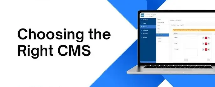
Choosing the Right CMS: A Beginner’s Guide for Your Website
Introduction: What is a CMS? A Content Management System (CMS) is a platform that allows users to create, edit, and manage content on their websites without the need for extensive coding knowledge. Choosing the Right CMS: A Beginner’s Guide for Your Website is one of the most critical decisions you’ll make when setting up a website, as it can impact the overall functionality, user experience, and growth potential of your site. With a variety of CMS platforms available, it’s essential to Choosing the Right CMS: A Beginner’s Guide for Your Website one that fits your unique needs, technical skill level, and long-term goals. In this guide, we will break down the different types of CMSs and key factors to consider when making your choice. Key Considerations When Choosing a CMS 1. Ease of Use: For beginners, the ease of use is one of the most critical aspects of a CMS. Some platforms are intuitive and beginner-friendly, while others may require a steeper learning curve. WordPress is known for its user-friendly interface, making it an excellent option for beginners. Joomla and Drupal typically necessitate a higher level of technical expertise. 2. Customization and Flexibility: Depending on the needs of your website, you may require different levels of customization. A CMS should offer a range of themes, plugins, and extensions to personalize the site to your liking. WordPress offers thousands of plugins and themes for easy customization. Shopify, designed for eCommerce, provides a more focused set of customization options for online stores. 3. Cost and Budget: CMS platforms can vary significantly in terms of cost. Some are open-source and free to use but may require paid plugins or hosting services, while others charge a subscription fee. WordPress.org is free but requires hosting. Squarespace and Wix offer subscription-based models. 4. SEO Capabilities: If you’re building a website, Search Engine Optimization (SEO) is crucial to ensure your site ranks well on search engines. Some CMS platforms come equipped with SEO tools to help with on-page optimization. WordPress offers SEO plugins like Yoast SEO to optimize your site. Squarespace has built-in SEO features but might be less flexible than WordPress. 5. Support and Community: As a beginner, you’ll likely need support, whether through customer service or a community of users. Some platforms provide extensive support documentation, while others have large online communities that offer tips, tutorials, and forums. WordPress boasts a large and active user community, along with numerous tutorials and resources.Wix and Squarespace offer direct customer support. Here are Choosing the Right CMS: A Beginner’s Guide for Your Website Popular CMS Platforms for Beginners 1. WordPress.org: Best for: General websites, blogs, eCommerceWordPress.org is a powerful and flexible content management system (CMS) that allows users to build and manage highly customizable websites and blogs. Unlike WordPress.com, it is self-hosted, meaning users need to arrange their own hosting and domain, but it offers full control over site design and functionality. With a vast library of themes and plugins, WordPress.org supports extensive customization to meet various needs, from simple blogs to complex e-commerce sites. Its open-source nature ensures ongoing development and a strong community for support and updates. Ideal for those with some technical know-how, WordPress.org provides the tools to create a fully tailored online presence. Pros: Cons: 2. Wix: Best for: Small business websitesWix is a popular website builder known for its easy-to-use drag-and-drop interface, allowing users to create professional-looking websites without coding skills. It offers a wide selection of customizable templates and design elements to tailor your site to specific needs and preferences. Wix provides built-in features for e-commerce, blogging, and SEO, along with various integrations to enhance functionality. Its cloud-based platform ensures that your site is accessible and responsive across all devices. With robust customer support and frequent updates, Wix simplifies the website creation process while offering flexibility and scalability. Pros: Cons: 3. Shopify: Best for: eCommerceShopify is a leading e-commerce platform designed to help businesses of all sizes build and manage online stores effortlessly. It offers a range of customizable templates and features for selling products, managing inventory, and processing payments securely. Shopify’s intuitive interface allows users to set up their store quickly without needing technical expertise. Additionally, it provides integrated tools for marketing, SEO, and analytics, enabling businesses to optimize their online presence. With robust support and a wide array of third-party apps, Shopify is a comprehensive solution for growing and scaling e-commerce ventures. Pros: Cons: 4. Squarespace: Best for: Creative professionalsSquarespace is a user-friendly website builder that offers an all-in-one platform for creating visually appealing websites with ease. Known for its elegant, professionally designed templates, it allows users to customize layouts and styles without needing coding skills. Squarespace integrates various features such as e-commerce, blogging, and analytics, catering to a wide range of business and personal needs. Its intuitive drag-and-drop interface and responsive design ensure that sites look great on any device. With built-in hosting and customer support, Squarespace provides a streamlined solution for building and managing websites. Pros: Cons: 5. Joomla: Best for: Advanced usersJoomla is an open-source CMS recognized for its versatility and intuitive user experience. It allows users to build and manage a wide range of websites, from simple blogs to complex e-commerce platforms, with ease. Joomla offers a robust framework for developing custom applications and extensions, providing versatility in site design and functionality. Its strong community support and extensive library of plugins and templates make it a popular choice for both beginners and experienced developers. Regular updates and a focus on security further enhance Joomla’s reliability and performance. Pros: Cons: Conclusion: Selecting the appropriate CMS is essential for creating an effective and successful website. Whether you are looking for a beginner-friendly platform like WordPress, a creative design-focused option like Squarespace, or an eCommerce powerhouse like Shopify, there is a CMS to fit your needs. Evaluate your technical expertise, financial resources, and future objectives before finalizing your choice. Also Read: The Impact of Mobile-First Design on User Experience
10 Essential Principles of User-Centered Design

Introduction: The 10 Essential Principles of User-Centered Design is a critical approach in creating products and services that truly resonate with users by prioritizing their needs and experiences. This methodology emphasizes understanding users’ behaviors, goals, and challenges to web design solutions that are intuitive and effective. The core of UCD lies in integrating user feedback throughout the design process to ensure that the end product aligns with their expectations. By focusing on the user’s perspective, designers can identify and address pain points, leading to more successful and engaging solutions. The following principles offer a framework for achieving these goals, guiding designers in crafting user experiences that are both functional and delightful. Here are 10 essential principles of User-Centered Design that are crucial for creating effective and engaging user experiences: 1. Understand Your Users: Understanding your users involves deeply researching and analyzing their behaviors, needs, and preferences. By conducting interviews, surveys, and user observations, designers can gain valuable insights into what motivates and challenges users. This knowledge helps create more relevant and tailored design solutions that address specific user pain points. Understanding users ensures that the design process aligns with real-world needs and enhances overall user experience. Ultimately, a thorough grasp of user profiles leads to more effective and engaging products. 2. Involve Users Early and Often: Involving users early and often in the design process ensures that their needs and preferences are accurately understood and addressed. Engaging users through interviews, surveys, and usability testing from the start helps identify potential issues and gather valuable feedback. Regular user involvement allows for iterative improvements, making sure the design evolves in alignment with real user expectations. This collaborative approach fosters a user-centered design that is more effective and relevant. Ultimately, involving users throughout the process leads to a product that better meets their needs and enhances overall satisfaction. 3. Design for Usability: Designing for usability focuses on creating intuitive and efficient user interactions with a product. This involves ensuring that interfaces are easy to navigate, with clear labels and logical workflows. Usability design also prioritizes simplicity, minimizing unnecessary elements that could overwhelm users. By emphasizing user-friendly features and consistent feedback, designers make tasks straightforward and reduce the learning curve. Ultimately, designing for usability enhances user satisfaction and effectiveness, leading to a more successful and accessible product. 4. Prioritize User Goals and Tasks: Prioritizing user goals and tasks involves focusing on what users need to accomplish and structuring the design to support those objectives effectively. By identifying and understanding the most critical tasks users perform, designers can streamline workflows and reduce unnecessary complexity. This approach ensures that the design aligns with user priorities, enhancing overall efficiency and satisfaction. Prioritizing user goals helps in creating intuitive interfaces and features that directly address user needs. Ultimately, it leads to a more user-centric product that facilitates easier and more effective interactions. 5. Create Personas and Scenarios: Creating personas and scenarios helps designers deeply understand and address the needs of various user types. Personas are fictional, yet realistic, representations of target users that illustrate their goals, behaviors, and pain points. Scenarios depict how these personas interact with the product in real-life situations, providing context for design decisions. By developing and utilizing personas and scenarios, designers can make informed choices that cater to real user needs and enhance usability. This approach ensures that design solutions are grounded in actual user experiences and expectations. 6. Emphasize Accessibility: Emphasizing accessibility ensures that your design is usable by people of all abilities and disabilities. Incorporating features like text alternatives for images, keyboard navigation, and clear color contrast helps make content accessible to users with visual, auditory, or motor impairments. Prioritizing accessibility not only broadens your audience but also enhances overall usability for everyone. By adhering to accessibility standards and guidelines, you create a more inclusive and equitable user experience. Ultimately, emphasizing accessibility demonstrates a commitment to meeting diverse user needs and improving engagement. 7. Iterate and Refine: Iterate and refine is a critical practice in design that involves continuously improving a product through repeated cycles of testing and feedback. By prototyping and gathering user input, designers can identify areas for enhancement and address issues early in the process. Each iteration allows for incremental improvements, ensuring that the final product better meets user needs and expectations. This iterative approach helps in adapting to changes and optimizing the design based on real-world use. Ultimately, iterating and refining leads to a more polished and effective end result. 8. Maintain Consistency: Maintaining consistency in design is essential for creating a cohesive and intuitive user experience. Consistent use of colors, fonts, and layout patterns helps users quickly understand and navigate the interface. It also reinforces brand identity and makes interactions more predictable and reliable. Consistency reduces confusion and enhances usability by providing a uniform visual and functional experience. Ultimately, a consistent design approach fosters user trust and contributes to a more effective and professional appearance. 9. Design for Feedback: Designing for feedback involves creating systems and interfaces that actively encourage and facilitate user input. By incorporating features such as feedback forms, surveys, and interactive elements, you can gather valuable insights into user experiences and preferences. This approach helps identify usability issues, refine design choices, and enhance overall user satisfaction. Regularly integrating user feedback into the design process ensures that the product evolves in alignment with user needs and expectations. Ultimately, designing for feedback fosters a user-centric approach that drives continuous improvement and innovation. 10. Measure and Evaluate Success: Measuring and evaluating success is crucial for understanding the effectiveness of any project or strategy. By defining clear metrics and key performance indicators (KPIs), you can track progress and assess whether goals are being met. Regular evaluation allows for data-driven decisions, helping to identify areas for improvement and refine strategies. Success measurement also provides insights into what works well and what needs adjustment, ensuring continuous growth and optimization. Ultimately, effective evaluation is key to achieving and sustaining long-term success. Also Read: Choosing the Right CMS: A Beginner’s Guide