Design Layout Troubleshooting Tips
Introduction: A compelling layout is the backbone of any successful graphic design project. Whether you’re designing a website, a poster, a social media ad, or a magazine spread, the layout determines how information is organized, perceived, and acted upon. But even experienced designers occasionally hit snags—misaligned elements, poor visual hierarchy, or compositions that simply don’t “feel” right. Troubleshooting design layout tips is as important as creating them. In this blog post, we’ll dive into practical tips and methods to troubleshoot and improve design layouts. From alignment issues to spacing woes and color imbalance, we’ll walk you through actionable fixes to elevate your designs. 1. Recheck the Grid System: The Problem: Elements look scattered or inconsistent. The Fix: Start by revisiting your grid system. Grids bring consistency and structure to your layout. If your design feels disorganized, it’s likely you’ve deviated from your grid or not used one at all. Pro Tips: 2. Audit Visual Hierarchy: The Problem: Viewers aren’t sure where to look first. The Fix: Visual hierarchy directs attention using size, weight, and placement. When all elements carry the same visual weight, nothing captures attention. Pro Tips: 3. Align with Purpose: The Problem: Design looks “off” but you can’t pinpoint why. The Fix: Misalignment is often the culprit behind unbalanced visuals. Check the alignment of text, images, icons, and shapes. Even small misalignments can create visual tension. Pro Tips: 4. Contrast Issues? Check Your Colors and Typography: The Problem: Text blends into the background or lacks emphasis. The Fix: Contrast ensures readability and aesthetic appeal. It’s not just about colors but also font weights, sizes, and shapes. Pro Tips: 5. Inconsistent Spacing: The Problem: The layout feels cramped or overly spaced out. The Fix: Spacing gives elements room to breathe. Irregular gaps and misaligned margins can disrupt the coherence and balance of a layout. Pro Tips: 6. Watch Out for Clutter: The Problem: Your design feels heavy or overwhelming. The Fix: Clutter arises from too many elements, colors, fonts, or images competing for attention. Simplify. Pro Tips: 7. Rethink Focal Points: The Problem: Key messages or CTAs get lost. The Fix: Every layout needs a focal point—an area that grabs the viewer’s attention first and leads them through the rest of the content. Pro Tips: 8. Balance and Symmetry: The Problem: Your design feels unstable or awkward. The Fix: Balance involves arranging design elements so their visual weight is evenly spread across the layout. Asymmetry can work, but if not handled well, it creates tension. Pro Tips: 9. Typography Troubleshooting: The Problem: The text is hard to read or visually unappealing. The Fix: Problems with typography typically arise from mismatched fonts, incorrect sizing, or flawed formatting choices. Pro Tips: 10. Test Responsiveness and Adaptability: The Problem: Layouts break on different screens or print sizes. The Fix: If you’re working on digital layouts, responsiveness is key. On print, check how elements scale or shift with different sizes or fold types. Pro Tips: 11. Use Visual Cues Wisely: The Problem: Users don’t know how to navigate or interact with your layout. The Fix: Visual cues like arrows, lines, or icons can guide user attention and interaction. Pro Tips: 12. Zoom Out for the Big Picture: The Problem: You’re too close to the design to see the issue. The Fix: Zooming out or stepping away helps you see the layout with fresh eyes. This often reveals imbalances or awkward spacing you might miss when zoomed in. Pro Tips: 13. Prototype and Iterate: The Problem: You’re not sure if the layout works. The Fix: Prototype your design and test it. Feedback from real users or viewers is invaluable. Pro Tips: 14. Trust Your Instincts—But Validate Them: The Problem: Something feels off, but you can’t explain it. The Fix: Designers often have a gut feeling about visual problems. Trust your instincts, but support them with solid design fundamentals. Pro Tips: Conclusion: Layout troubleshooting is part art, part science. It involves not just correcting visible mistakes, but also optimizing the user experience, improving visual flow, and creating clarity. By methodically evaluating your design against the principles above—alignment, balance, contrast, hierarchy, and spacing—you’ll be better equipped to diagnose and fix layout problems before they derail your project. Remember, every great layout started with a few iterations. Troubleshooting isn’t a sign of failure—it’s a vital step toward design excellence.
Solving Typography Alignment Problems
Introduction: Typography is not just about selecting the right font or pairing typefaces creatively; it’s also about how the text aligns within a design. The way text is aligned significantly influences how readable it is, how visually appealing a design feels, and how clearly a message is conveyed. However, even experienced designers can run into alignment problems that derail a layout’s balance and harmony. Whether you’re designing a website, a poster, or social media graphics, solving typography alignment problems is essential for creating polished and professional designs. In this article, we’ll explore common typography alignment issues in graphic design, why they matter, and practical solutions to fix them. Why Typography Alignment Matters: Before diving into problems and solutions, it’s important to understand why alignment is such a big deal. Typography alignment is the visual arrangement of text in relation to margins, images, and other design elements. Proper alignment: Enhances reading flow – Properly aligned text allows the eyes to move smoothly, making the content easier to understand. Enhances visual hierarchy – Strategic alignment guides the reader’s eye through the content. Creates balance – Properly aligned typography makes a design feel stable and aesthetically pleasing. Increases professionalism – Misaligned text gives an amateur feel and undermines trust. Yet alignment is often overlooked, especially by beginners or in fast-paced workflows. Let’s explore some typical typography alignment problems and how to fix them. 1. Misaligned Baselines: The Problem: When using different font families or sizes, the baselines of text blocks can become misaligned. This creates a jagged appearance and breaks visual harmony. The Solution: Use baseline grids in design software like Adobe InDesign or Figma. This ensures all text aligns to a common horizontal axis. When mixing fonts, adjust the baseline shift or leading to make sure they sit visually even. Consider x-height and cap height when pairing fonts. Fonts with drastically different x-heights will appear misaligned even when they technically aren’t. 2. Inconsistent Text Box Padding and Margins: The Problem: Text may be aligned on the page, but the spacing inside text containers is inconsistent. This causes awkward gaps or crowding, especially around buttons, banners, or content blocks. The Solution: Apply consistent padding and margin rules using design systems or stylesheets. Use grid systems to maintain uniform spacing. Don’t rely solely on visual centering—measure the padding and use consistent values. 3. Vertical Alignment Issues: The Problem: Aligning text vertically in the middle of buttons, banners, or boxes is harder than it seems. Often the text looks slightly off, even when it’s technically centered. The Solution: Consider the optical center rather than the mathematical center. Vertical centering is affected by how people perceive the shapes of letters. Use line-height adjustments to nudge text into place. For precise control, use tools like Flexbox (in web design) or alignment tools in design apps that align to optical centers. 4. Improper Text Alignment for Content Type: The Problem: Using center alignment for long paragraphs or right-aligning body text reduces readability and creates a disorganized flow. The Solution: Use left alignment for body text in most Western languages for natural reading flow. Center alignment works best for short lines of text like titles or quotes. Right alignment can be used sparingly for stylistic purposes but should not dominate a design. 5. Ignoring Alignment with Other Design Elements: The Problem: Text doesn’t align with grids, images, or other visual elements, causing a fragmented layout. The Solution: Use a consistent grid system (12-column, 8-point grid, etc.) to align text and images together. Snap text blocks to the same horizontal and vertical guides as other elements. Don’t just eyeball it—use rulers and alignment tools in your design software. 6. Justified Text Problems: The Problem: Justified text can appear tidy at first glance, but it frequently results in uneven gaps between words and distracting streams of white space. The Solution: Only use justified text for large blocks of text where hyphenation and word spacing can be managed. Steer clear of using justified alignment for short passages or online content, as it can disrupt readability. Use hyphenation settings and fine-tune justification controls in programs like Adobe InDesign. 7. Not Accounting for Optical Alignment: The Problem: Even when text is technically aligned, it may not look aligned due to the unique shapes of letters. For example, an uppercase “A” aligned with a box might look slightly off because its pointy shape doesn’t fill the space evenly. The Solution: Use optical alignment where necessary. This means adjusting elements slightly off the mathematical alignment for better visual balance. Pay attention to characters like T, A, and J, which often need manual adjustment to appear centered or aligned. Rely on your visual judgment—when something doesn’t look quite right, it usually isn’t. 8. Neglecting Responsive Alignment in Web Design: The Problem: A design might look great on a desktop screen but fall apart on mobile devices because of alignment issues. The Solution: Use responsive design principles with flexible grids and scalable units (like em or rem). Test typography on multiple screen sizes. Employ media queries to adjust alignment and spacing as needed. 9. Overusing Manual Adjustments: The Problem: Making manual nudges or using the spacebar to align text may work in the short term but creates inconsistent and unscalable designs. The Solution: Use built-in alignment tools and snapping features in your design software. Create styles and templates to ensure consistency across designs. Refrain from positioning elements by hand without aligning them to established grids or guide lines. 10. Alignment in Multilingual Designs: The Problem: When designing for multiple languages, alignment can break due to differing text lengths or script directions (e.g., left-to-right vs. right-to-left languages). The Solution: Design layouts with flexible containers that adapt to varying text lengths. Use alignment settings that support RTL and LTR languages, and test with real translated content. Avoid fixed widths or hard-coded line breaks that might not scale across languages. Tips for Better Typography Alignment: Here are some general best practices to keep your typography alignment sharp: Conclusion: Typography alignment
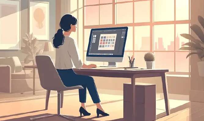
Improving Graphics Design Workflow
Introduction: In today’s competitive creative landscape, efficiency is just as important as creativity in graphic design. A well-structured workflow helps designers manage time, meet deadlines, and maintain consistency across projects. Without a streamlined process, even the most talented designers can face delays, miscommunication, and burnout. Improving your graphics design workflow not only boosts productivity but also enhances the quality of your work. It allows for better collaboration, faster revisions, and smoother client approvals. By optimizing each stage of the design process, you create more space for innovation. This article explores practical ways to refine and elevate your graphics design workflow. Why Workflow Matters in Graphic Design: Before diving into the how-to, it’s important to understand why optimizing your workflow matters: Saves Time: A refined workflow reduces unnecessary steps, allowing more time for creativity and execution. Enhances Collaboration: A structured process ensures better communication between team members, clients, and stakeholders. Minimizes Errors: Efficient workflows help maintain consistency, reduce rework, and avoid miscommunication. Boosts Creativity: When repetitive tasks are automated or simplified, designers have more mental bandwidth to focus on design. Step-by-Step Guide to Improve Your Graphics Design Workflow 1. Define Your Design Process: Every project should follow a structured process. A typical graphic design workflow includes the following stages: Clearly defining these stages helps avoid confusion and ensures everyone involved knows what to expect. 2. Use Creative Briefs Effectively: An effective design project starts with a well-crafted creative brief, which should cover the following essentials: Using a template for briefs can help standardize this step and make it faster and easier to gather essential information. 3. Organize Your Assets: An often-overlooked area of design workflow is asset management. Having a centralized, well-organized repository for design assets—like logos, icons, fonts, and stock images—saves significant time during the creation phase. Use folders and clear naming conventions, or adopt a Digital Asset Management (DAM) tool like: 4. Choose the Right Tools and Software: Your choice of tools can make or break your design efficiency. While Adobe Creative Suite (Photoshop, Illustrator, InDesign) remains the industry standard, there are many others depending on your needs: Figma or Adobe XD – Great for UI/UX and collaborative design Canva – Useful for quick, templated designs Affinity Designer – A cost-effective alternative to Illustrator Procreate – Excellent for digital illustration Additionally, using project management tools such as Trello, Asana, or Notion can help track progress and deadlines. 5. Set Up Design Templates and Style Guides: Reusable templates can save hours of work, especially for recurring tasks like social media graphics, brochures, or presentations. Combine this with a design style guide that includes: Having these in place ensures consistency across all designs and makes onboarding new team members easier. 6. Embrace Version Control: Nothing is worse than losing track of your design changes. Adopt version control practices such as: This ensures you can roll back to previous versions without stress. 7. Streamline Feedback and Approval: Feedback can become a bottleneck if not handled efficiently. To improve this step: 8. Automate Repetitive Tasks: Automation tools can significantly boost your workflow by handling repetitive or administrative tasks. Some useful options include: Zapier or Make.com – Set up automation to handle task distribution, manage file transfers, and trigger real-time alerts. Photoshop Actions – Streamline your design workflow by automating actions such as image scaling, file output, and effect application. Batch processing tools – Convert or resize multiple files at once This saves time and reduces human error. 9. Collaborate in Real-Time: Remote collaboration has become the norm. Tools like Figma and Miro allow multiple team members to work on the same design in real time. This: For communication, Slack or Microsoft Teams are great platforms to keep everyone in the loop. 10. Evaluate and Refine Your Workflow Regularly: Your workflow should evolve with your team, tools, and projects. Periodically ask: Conduct retrospectives after major projects to identify lessons learned and improvement opportunities. Bonus Tips for Boosting Creativity and Efficiency Here are a few extra techniques to elevate your graphic design workflow: Time Blocking: Allocate specific times for creative work, meetings, and administrative tasks to maintain focus. Mood Boards and Inspiration Libraries: Use Pinterest, Behance, or Milanote to gather design inspiration quickly. Keyboard Shortcuts: Mastering shortcuts in your design software can dramatically reduce time spent on repetitive actions. Use Grids and Layout Systems: These help maintain structure and consistency, speeding up layout creation. Take Breaks: Step away from your work to recharge your creativity—burnout kills efficiency and innovation. Conclusion: Improving your graphics design workflow is not a one-time fix but an ongoing process of evaluation, adaptation, and innovation. By implementing structured processes, using the right tools, and automating repetitive tasks, designers can free up time to focus on what matters most—creating impactful, beautiful designs. In a competitive industry where time and quality are both critical, a smooth workflow gives you the edge you need to consistently deliver excellence. Start small, pick one area to improve this week, and build from there.
Fixing Common Design Mistakes
Introduction: Design is a vital element that influences how individuals engage with products, websites, and brands. However, even the most visually appealing concepts can fall short if fixing common design mistakes are overlooked. Issues like inconsistent typography, poor color choices, or cluttered layouts can confuse users and reduce engagement. These errors are often subtle but have a significant impact on usability and aesthetics. Whether you’re a beginner or an experienced designer, identifying and correcting these mistakes is crucial for improving your work. In this blog post, we’ll highlight the most frequent design errors and offer practical tips to fix them. By addressing these challenges, you can create cleaner, more effective, and user-centered designs. 1. Overcomplicating the Layout: The Mistake: Designers sometimes try to do too much at once—cramming in too many elements, using complex grids, or layering too many styles. The result? A cluttered layout that overwhelms users. The Fix: Embrace simplicity by adopting minimalist design principles. Utilize ample white space, group similar elements, and maintain a consistent grid layout. A clear and structured information hierarchy allows users to effortlessly prioritize and engage with the most important content. Platforms like Figma and Adobe XD are valuable for visualizing this structure before development. 2. Ignoring Visual Hierarchy: The Mistake: Visual hierarchy helps users navigate your design without consciously thinking about it. When everything looks the same, nothing stands out, and users struggle to know where to look first. The Fix: Use size, color, contrast, and placement to guide attention. Headlines should be larger and bolder. Make sure buttons and calls to action stand out visually. Structure your layout by prioritizing key elements first, guiding users through content in order of importance. Think of your design like a map: the most critical information should always be easy to find. 3. Inconsistent Typography: The Mistake: Relying on numerous fonts or mismatched styles can make your design look disorganized and unpolished. Random shifts in font size or weight across pages break the visual rhythm and confuse the viewer. The Fix: Limit your typography to two or three well-matched fonts and use them consistently throughout your design. Create a clear type hierarchy with defined sizes for titles, subtitles, and body text. Maintain uniformity in spacing, alignment, and formatting. Resources like Google Fonts can help you find and test effective font combinations. 4. Poor Color Choices: The Mistake: Clashing colors, poor contrast, and inconsistent color usage can ruin an otherwise good design. Worse, low contrast can make your design inaccessible to people with visual impairments. The Fix: Stick to a defined color palette with primary, secondary, and accent colors. Use tools like Coolors, Adobe Color, or Contrast Checker to choose accessible and harmonious color schemes. Make sure text has enough contrast against its background, especially for body text. 5. Neglecting Mobile Users: The Mistake:Designing only for desktop and ignoring mobile responsiveness is a major issue, especially since most users access websites on their phones. The Fix:Apply responsive design techniques by using adaptable grids, resizable images, and media queries to maintain visual consistency across devices. Make sure to preview your layout on different screen sizes and orientations to identify and fix any display problems early on. 6. Unclear Navigation: The Mistake: A confusing navigation structure leads to high bounce rates and frustrated users. Menus that are hard to find or not intuitive can derail the user journey. The Fix: Stick with conventional navigation patterns. Place menus where users expect them—usually top or left of the screen. Keep labels clear and concise. Add breadcrumbs for deeper sites and ensure all interactive elements are clearly clickable (use hover states, icons, etc.). 7. Forgetting About Accessibility: The Mistake: Designs that exclude users with disabilities create barriers and may even violate accessibility laws. Tiny text, no alt text for images, and poor color contrast are common offenders. The Fix: Follow WCAG (Web Content Accessibility Guidelines). Use semantic HTML, provide alt text for all images, ensure sufficient color contrast, and allow keyboard navigation. Creating accessible designs improves the experience for everyone, not only users with disabilities. 8. Using Low-Quality Images: The Mistake: Pixelated, stretched, or unrelated images can instantly devalue your design. Poor image choice makes even great layouts look amateurish. The Fix: Use high-resolution, relevant imagery. Stock photo sites like Unsplash, Pexels, and Shutterstock offer high-quality visuals. Always optimize images for web (without losing quality) using tools like TinyPNG or Squoosh to ensure fast loading times. 9. Overusing Effects and Animations: The Mistake: Animations and effects can enhance a design—but too many can distract users, slow down performance, and confuse navigation. The Fix: Use motion design purposefully. Keep animations subtle and use them to enhance usability, like drawing attention to a call-to-action or providing visual feedback. Skip flashy animations or transitions unless they enhance functionality or user experience. 10. Skipping User Testing: The Mistake: Even the most beautiful design can fail if it doesn’t work for users. Designing based on assumptions rather than actual feedback often leads to usability issues. The Fix: Conduct user testing regularly. Start with low-fidelity wireframes and collect feedback before moving to high-fidelity designs. Use tools like UsabilityHub, Maze, or Lookback to test designs and gather insights. Design with the user in mind, not merely on their behalf. Conclusion: Design isn’t just about aesthetics—it’s about solving problems and improving the user experience. The most successful designs are those that quietly guide users toward their goals without friction or confusion. By identifying and fixing these common mistakes, you can dramatically improve the impact of your work. Great design comes from iteration. Don’t be afraid to make mistakes—but do learn from them. The more you pay attention to these small yet critical details, the more confident and skilled you’ll become as a designer.
Marketing Yourself as a Designer
Introduction: In today’s competitive creative industry, being a skilled graphic designer isn’t enough—you also need to know how to market yourself effectively. Whether you’re freelancing or working in a studio, how you present your work and personal brand can make or break your career. Marketing yourself goes beyond having a stunning portfolio; it involves strategic self-promotion, networking, and building a recognizable identity. Every element, from your online presence to positive client feedback, plays a crucial role in shaping your professional image. The goal is to stand out in a crowded marketplace and attract the right opportunities. In this guide, we’ll explore actionable ways to boost your visibility and credibility as a graphic designer. 1. Define Your Brand as a Designer: Defining your brand as a designer is the first step toward standing out in a crowded creative market. Your brand is more than just a logo—it’s the message, style, and values that set you apart. It tells potential clients who you are, what you do best, and why they should work with you. A strong personal brand builds trust and makes your work instantly recognizable. In this section, we’ll explore how to craft a brand identity that truly reflects your unique design voice. Ask yourself: Once you’ve answered these, craft a brand statement—a short, powerful message that communicates what you do and why someone should hire you. For example: Maintaining consistency in your portfolio, social media, and messaging is crucial. Your audience should instantly recognize your work and connect it to your distinct style and methodology. 2. Build a Killer Portfolio: As a graphic designer, your portfolio is your strongest asset—it reflects your talent, versatility, and approach to solving design challenges. More than just a gallery of images, it communicates the thought process and impact behind each project. A well-crafted portfolio highlights not only what you create but how you think. Since it often serves as your first impression, it must be intentional, polished, and professional. In this section, we’ll guide you through building a portfolio that captures attention and leaves a lasting mark. Tips for building a strong portfolio: Tools like Adobe Portfolio, Behance, Webflow, or Squarespace are great for designers who want control without too much coding. 3. Leverage Social Media Smartly: Social media is more than just a place to share your latest designs—it’s a powerful platform to market yourself as a graphic designer. When used strategically, it helps you build a personal brand, connect with potential clients, and showcase your creative process. Each platform offers unique opportunities to engage with different audiences. The key is consistency, authenticity, and value-driven content. In this section, we’ll look at how to use social media smartly to grow your visibility and reputation. Platforms to consider: Tips: 4. Crafting Content That Showcases Your Design Expertise: Creating valuable content is one of the best ways to establish yourself as an expert in the graphic design industry. By sharing your knowledge, insights, and creative process, you build trust and authority with your audience. This not only attracts potential clients but also sets you apart from other designers. Whether it’s through blogs, videos, or tutorials, your content can showcase your expertise beyond just visuals. In this section, we’ll explore how to create impactful content that elevates your professional reputation. Consider these content formats: By sharing your knowledge, you establish yourself as a credible expert, rather than just another designer in the crowd. 5. Network Online and Offline: Networking, both online and offline, is essential for growing your career as a graphic designer. Fostering authentic relationships can open doors to fresh opportunities, partnerships, and lasting client connections. In today’s digital world, it’s just as important to engage in virtual communities as it is to attend local events or meetups. The key is to be proactive, approachable, and consistent in your interactions. In this section, we’ll discuss effective ways to network and expand your reach in the design industry. Online networking: Offline networking: Always have a digital business card or QR code ready to share your portfolio—you never know when an informal chat could lead to a potential client. 6. Ask for Testimonials and Referrals: Asking for testimonials and referrals is a powerful way to build credibility and attract new clients. Positive feedback from past clients can serve as social proof of your expertise and reliability. Encouraging referrals helps expand your network and brings in new opportunities. In this section, we’ll discuss how to effectively ask for testimonials and leverage them to grow your design business. Tips: 7. List Yourself on Freelance and Portfolio Sites: Listing yourself on freelance and portfolio sites is a great way to increase your visibility and attract potential clients. Platforms like Behance, Dribbble, and Upwork offer exposure to a global audience. These sites help build credibility and provide a space to showcase your best work. In this section, we’ll explore how to effectively use these platforms to grow your design career. Visibility matters, especially when you’re starting out. Listing yourself on platforms like: …can bring in steady traffic and clients. Make sure your profile is complete, well-written, and includes standout examples of your work. Also, don’t underestimate local directories or creative job boards like We Work Remotely, Design Jobs Board, and Working Not Working. 8. Invest in Paid Advertising: Investing in paid advertising can be an effective way to boost your visibility and attract new clients. Platforms like Google Ads and social media ads allow you to target specific audiences, increasing the chances of reaching potential customers. It’s a great way to scale your marketing efforts once you have a clear niche and a strong portfolio. In this section, we’ll discuss how to strategically use paid ads to grow your design business. Options include: Begin with a modest budget, experiment with various creatives and target audiences, and monitor your return on investment closely. 9. Keep Learning and Evolving: To stay relevant in the constantly changing design landscape, continuous skill development is key. Embracing new tools, techniques, and trends keeps your
Successful Designers’ Pro Tips
Introduction: In the ever-evolving world of graphic design—whether it’s graphic, web, interior, or product design—staying relevant means more than just following trends. It’s about mastering the fundamentals, continuously learning, and honing your creative instincts. The most successful designers don’t rely solely on talent; they embrace habits and mindsets that push their skills, projects, and careers to new heights. Whether you’re a student, a freelancer, or a seasoned creative professional, this deep dive into successful designers’ pro tips can elevate your game and help you thrive in a competitive industry. 1. Design with Purpose, Not Just Aesthetics: Great design is more than just looking good—it communicates, solves problems, and guides behavior. Successful designers understand that aesthetics should serve a function. Before jumping into colors and typography, they ask the critical questions: Pro Tip: Begin every project with a solid foundation—set specific goals, outline user pathways, and create mood boards or wireframes to ensure your visual choices support the overall purpose and user intent. 2. Master the Art of Listening: Designers aren’t just visual creators; they are communicators and collaborators. Top-tier designers listen more than they speak—absorbing client needs, interpreting stakeholder feedback, and understanding user pain points. Pro Tip: During client meetings, jot down comprehensive notes and paraphrase their input to ensure clarity—this simple habit helps prevent misunderstandings and builds strong, reliable relationships. 3. Iterate Relentlessly: A winning design almost never takes shape on the initial attempt. Professionals embrace the iterative process—design, test, get feedback, and refine. Each round brings new clarity. Pro Tip: Avoid getting attached to your initial concept. Develop several alternatives, and don’t hesitate to discard ideas that aren’t working. Save all drafts, as an earlier version may hold hidden potential. 4. Build a Powerful Visual Vocabulary: From font pairings and color theory to composition and layout, successful designers continuously build their visual vocabulary. They stay curious, explore design history, and dissect what makes certain visuals “work.” Pro Tip: Create a personal design swipe file—a folder of screenshots, magazine clippings, packaging, or branding you admire. Analyze them regularly to train your eye and find inspiration. 5. Stay Software-Agnostic, But Technically Fluent: Knowing how to use tools like Adobe Creative Suite, Figma, Blender, or AutoCAD is essential. But software changes. The best designers adapt quickly and choose the right tool for the task rather than getting stuck in one ecosystem. Pro Tip: Every year, try learning one new tool or plugin. It keeps your skills fresh and helps you stay competitive in job markets. 6. Develop a Signature Style—Then Learn to Break It: Every great designer eventually develops a personal aesthetic or design language. It’s how your work becomes recognizable. But successful designers also know when to break their own style to meet a project’s needs. Pro Tip: Recognize the patterns in your designs to establish your unique style, then push your boundaries by exploring projects that stretch your skills. Real progress happens when you push past your comfort zone. 7. Use Constraints as Creative Catalysts: Budgets, timelines, branding rules—these can feel limiting. But successful designers thrive within constraints. Limitations often force smarter, more inventive solutions. Pro Tip: Reframe constraints as creative opportunities. Ask yourself, “What can I do within this limitation that’s unexpected?” 8. Treat Feedback as Fuel: Design is subjective, and not every piece you create will hit the mark. Instead of getting defensive, successful designers view feedback—especially critical feedback—as an opportunity to grow. Pro Tip: Request detailed feedback, such as, ‘Which aspect of the layout feels off?’ or ‘Which element doesn’t connect?’ This helps you gather practical advice instead of vague suggestions. 9. Keep an Organized Workflow: A cluttered file system or inconsistent naming conventions might seem trivial, but it can derail collaboration and waste hours. Great designers know that professional organization equals efficiency. Pro Tip: Develop a consistent file-naming structure and use version control. Whether working solo or in a team, this saves time and shows clients you’re detail-oriented. 10. Market Yourself as a Brand: Even the most talented designers need visibility. Successful designers invest time in their personal brand—curating an online presence, networking with peers, and showcasing their work strategically. Pro Tip: Treat your portfolio as a storytelling tool, not just a gallery. Tell the “why” behind each project. Show process, not just final deliverables. 11. Collaborate and Network Constantly: Design doesn’t happen in a vacuum. The best creatives regularly bounce ideas off others, attend conferences, join critique groups, and build diverse teams. Pro Tip: Join design communities (online and offline). Participating in critiques or collaborative projects can sharpen your skills and open new doors. 12. Never Stop Learning: Design trends evolve, software updates roll out, and new mediums emerge (think AR, VR, and AI). Successful designers stay curious and never get too comfortable. Pro Tip: Set aside time each month for continued learning—take a short course, read industry blogs, or listen to design podcasts. Lifelong learners become industry leaders. 13. Understand the Business Side of Design: Design is only part of the equation—budgets, deadlines, proposals, and client relations all play a huge role in a project’s success. Many designers plateau because they neglect these areas. Pro Tip: Learn the basics of project management, pricing strategies, and contract writing. Consider partnering with a mentor or taking business development classes tailored to creatives. 14. Focus on User Experience (UX), No Matter the Medium: Even if you’re not a UX designer by title, your work impacts how people feel and interact with a product or space. Successful designers are user-focused at every step. Pro Tip: Conduct casual usability tests on your designs by having friends or coworkers explore your website prototype or review your brochure. 15. Take Breaks to Spark Creativity: Burnout kills good design. The most successful designers know when to step away and recharge. Fresh perspectives often come after rest. Pro Tip: Incorporate intentional breaks into your workflow. Go for a walk, sketch something unrelated, or do a completely different activity. Your brain continues processing ideas even while you relax. Conclusion: The most accomplished
Career Opportunities in Graphics

Introduction: In the visually-driven world of today, graphics play a central role in communication, entertainment, education, and business. From the sleek design of mobile apps to the eye-catching logos of top brands, graphic design and related fields shape the way we experience the world. As the digital landscape continues to grow, so do the career opportunities in graphics, offering a rich and diverse range of pathways for creative individuals. Whether you’re a budding artist, a tech-savvy designer, or someone intrigued by visual storytelling, the graphics industry offers something for everyone. This blog explores the many career options available in the field of graphics, the skills required, and how to get started on your creative journey. The Expanding Universe of Graphics: Graphics is a broad term that encompasses several disciplines, including: Each of these areas has its own unique demands and opportunities, yet they are all interconnected by a common thread — the ability to communicate messages visually and creatively. Top Career Opportunities in Graphics 1. Graphic Designer: Perhaps the most recognized role in this space, graphic designers create visual content for print and digital platforms. From business cards and brochures to social media posts and billboards, graphic designers are responsible for creating cohesive and visually appealing designs that convey a message effectively. Key Skills: Proficiency in Adobe tools like Photoshop, Illustrator, and InDesign, along with expertise in typography, layout composition, and brand identity. Industries: Advertising, publishing, marketing, corporate communications, and freelance. 2. UI/UX Designer: UX and UI designers specialize in enhancing user interaction and experience with digital platforms and applications. While UI designers work on the visual layout of apps and websites, UX designers ensure that the user journey is intuitive and satisfying. Key Skills: Wireframing, prototyping (Figma, Sketch, Adobe XD), user research, usability testing. Industries: Tech, e-commerce, startups, mobile app development. 3. Motion Graphics Designer: Motion graphics artists transform still images into dynamic animations using visual effects to create engaging content. This role is highly valued in video production, advertising, and digital media. Key Skills: Skilled in motion design tools such as After Effects, Premiere Pro, and Cinema 4D, with a strong grasp of animation fundamentals. Industries: Film, TV, advertising, online content, gaming. 4. 3D Artist/Animator: 3D artists create three-dimensional models and animations used in films, games, architecture, and virtual reality. This is a technically demanding but creatively rewarding field that requires both artistic and software skills. Key Skills: Blender, Maya, 3ds Max, ZBrush, rigging, rendering. Industries: Entertainment, architecture, engineering, product design. 5. Game Designer: Game designers develop and craft the visual elements that bring video game worlds and characters to life. This covers designing characters, building immersive environments, and crafting intuitive user interfaces. Having experience in narrative design, programming, and digital illustration offers a strong advantage. Key Skills: Unity, Unreal Engine, scripting, storyboarding, character design. Industries: Gaming, interactive media, AR/VR, simulation. 6. Visual Effects (VFX) Artist: VFX professionals craft both lifelike and imaginative scenes that can’t be captured on camera—like blasts, mythical beings, or alien landscapes. Key Skills: Nuke, Houdini, compositing, rotoscoping, CGI. Industries: Film, TV, advertising, streaming media. 7. Illustrator: Illustrators produce original artwork for everything from books and magazines to packaging and online media platforms. With the rise of online content, illustrators are now in demand for everything from editorial pieces to social media visuals. Key Skills: Drawing (traditional and digital), Adobe Illustrator, Procreate. Industries: Publishing, marketing, fashion, e-learning, entertainment. 8. Branding Specialist: Branding experts shape a company’s visual identity through elements like logos, color palettes, and style guides. Success in this role relies on a strong grasp of consumer insights and evolving marketing trends. Key Skills: Logo design, brand strategy, color theory, typography. Industries: Marketing agencies, startups, corporate, consulting. 9. Web and App Designer: These professionals focus on designing the layout and visual appeal of websites and mobile apps. They make sure digital platforms are both user-friendly and visually captivating. Key Skills: HTML/CSS, responsive design, Adobe XD, Figma, UI patterns. Industries: Tech, freelance, SaaS, e-commerce. 10. Art Director: Art directors oversee the visual style and direction of creative projects. They manage teams of designers and ensure that the visual elements align with the brand’s voice and goals. Key Skills: Leadership, project management, creative vision, budgeting, team collaboration. Industries: Advertising, publishing, film, corporate design teams. How to Start a Career in Graphics 1. Build a Strong Portfolio: A portfolio is your ticket into the industry. Whether it’s a website, PDF, or Behance profile, make sure it highlights your best work and reflects your personal style and capabilities. 2. Master the Tools of the Trade: Learning industry-standard tools like Adobe Creative Cloud, Figma, and animation software is crucial. Many tools also offer free trials and educational versions. 3. Take Courses and Certifications: Online platforms like Coursera, Udemy, LinkedIn Learning, and Skillshare offer quality courses in every graphic discipline. Formal education can help, but self-taught designers also thrive in this space. 4. Get Real-World Experience: Freelancing, internships, and collaborative projects are great ways to build experience. They also help you understand client communication and real-world challenges. 5. Stay Updated: Trends in design change rapidly. Follow design blogs, participate in online communities, and regularly update your skills to remain competitive. The Future of Careers in Graphics The graphics industry is evolving with technologies like artificial intelligence, augmented reality, and virtual reality. Designers are increasingly expected to understand coding, interactivity, and data-driven design. Sustainability and ethical design are also emerging areas of focus. As businesses continue to prioritize digital transformation, graphic professionals will remain in high demand. Moreover, with the rise of remote work, designers now have the flexibility to work with clients and companies across the globe. Conclusion: A career in graphics is not just about aesthetics — it’s about solving problems, telling stories, and making ideas come to life. Whether you prefer working with still images, dynamic videos, or interactive experiences, the opportunities are vast and varied. If you’re passionate about creativity, technology, and innovation, then the graphics field could be your ideal career path. With the
Building a Portfolio for Designers
Introduction: Building a Portfolio for Designers is one of the most essential steps in showcasing your creative skills and securing opportunities. A thoughtfully designed portfolio showcases your top projects while narrating your distinct design journey. Whether you’re a graphic designer, UX/UI expert, or branding specialist, your portfolio is your professional identity. It showcases how you approach challenges, your eye for design, and the technical skills you bring to the table. In today’s competitive market, standing out starts with an impactful online presence. A portfolio goes beyond visuals—it’s a tool for clear communication and effective storytelling. Why a Strong Portfolio Matters In the world of design, your portfolio often plays the biggest role in whether you land the job or project. A compelling portfolio showcases your design thinking, versatility, and ability to solve real-world problems. It tells potential clients or employers what you’re capable of without saying a word. Whether you’re applying for jobs, freelance gigs, or collaborations, your portfolio speaks on your behalf. It builds trust, credibility, and sets you apart from other designers. In short, a strong portfolio is the key to unlocking your next big opportunity. Before we explore the ‘how,’ it’s important to first understand the ‘why.’ A portfolio: Step 1: Understand Your Audience: Your portfolio needs to align with the kind of projects you aspire to take on. Hoping to collaborate with tech startups? Agencies? In-house corporate design teams? Your content, tone, and project selections should align with the expectations and aesthetics of your target audience. Tips: Step 2: Select the Right Projects: Not every project belongs in your portfolio. Choose 5–7 strong pieces that demonstrate versatility, creativity, and your ability to solve problems. Include a mix of: Remember: quality over quantity. It’s better to show 5 outstanding projects than 15 mediocre ones. Step 3: Tell a Story with Case Studies: Great design goes beyond aesthetics—it’s fundamentally about finding effective solutions to real problems. Each project should include a case study—a short narrative explaining your thought process. What to include in a case study: Pro Tip: Use visuals to guide the narrative—don’t rely on text alone. Step 4: Design the Portfolio Itself: You’re a designer—so the portfolio itself is a reflection of your design thinking. It must be clean, navigable, responsive, and aligned with your style. Platforms to consider: Must-haves: Make sure it’s mobile-friendly—many recruiters and clients browse on their phones. Step 5: Showcase Your Personality: People hire people—not just skills. Your tone, voice, and visuals should reflect who you are as a designer. Ways to show personality: Avoid sounding robotic or overly formal. Authenticity builds connection. Step 6: Keep It Updated: A stale portfolio signals inactivity. Regularly update your portfolio every 3 to 6 months to ensure it stays current and impactful: You can also keep a “WIP” (work-in-progress) or “experimental” section to share unfinished ideas and show your iterative process. Step 7: Optimize for Search and Shareability: If you’re publishing your portfolio online, make sure it’s discoverable and easy to share. Basic SEO tips: Social and community platforms: Make it easy for someone to find and share your portfolio with others. Step 8: Ask for Feedback: Before going live, get input from peers, mentors, or even potential users. Ask them: Fresh eyes can catch what you miss—and elevate your work. Bonus Tips for Freelancers: If you’re building a portfolio specifically for freelance work, consider including: Common Mistakes to Avoid: Your portfolio should clearly and engagingly showcase your abilities, not leave visitors lost in complexity. Small oversights like broken links or outdated projects can send the wrong message to potential clients or employers. Knowing what to avoid is just as crucial as understanding what to showcase. By avoiding these common pitfalls, you can create a portfolio that truly stands out. Even talented designers fall into common traps. Avoid these: Give your portfolio the same attention to detail and professionalism as you would a client’s project. Conclusion: Ultimately, your portfolio is far more than a display of your work—it embodies your voice, represents your brand, and serves as evidence of your worth as a designer. A thoughtfully crafted portfolio showcases not only your best work but also your thinking, process, and personality.Your portfolio is a constantly evolving reflection of your growth and progress as a designer. By steering clear of typical pitfalls and emphasizing clear communication and compelling narratives, you can build a portfolio that resonates with your audience. Whether you’re aiming for freelance opportunities or landing your ideal role, a well-built portfolio can be your greatest asset. Approach it with the same level of dedication and precision as any client assignment. Remember, in the world of design, how you present your work matters just as much as the work itself.
Freelancing as a Graphic Designer
Introduction: The freelance graphic design industry has experienced significant growth over the past decade. With the rise of remote work, digital platforms, and a global appetite for visual content, freelancing has become not just a career choice, but a lifestyle for many creative professionals. Whether you’re just starting out or thinking about leaving your 9-to-5 job, freelancing as a graphic designer offers flexibility, autonomy, and creative freedom — but it also comes with unique challenges. In this blog post, we’ll explore what it takes to succeed as a freelance graphic designer, from building your brand to finding clients, managing projects, and scaling your business. Why Choose Freelancing as a Graphic Designer? Before exploring how to get started, it’s important to first understand why freelancing is such an attractive option for many creatives. Creative Freedom: Unlike traditional in-house or agency roles, freelancing lets you choose the type of work you take on. Want to design logos for indie bands? Or brand identities for tech startups? As a freelancer, you decide. Flexible Schedule: You have the freedom to tailor your work hours to your peak productivity—be it at the break of dawn or deep into the night. This flexibility is especially helpful for parents, students, or those with multiple commitments. Global Clientele: With platforms like Upwork, Fiverr, and Behance, your reach isn’t limited by geography. You can collaborate with clients around the world without leaving your home office. Unlimited Earning Potential: Unlike salaried positions, your income as a freelancer is not capped. As you gain experience, build a reputation, and streamline your workflow, your rates — and earnings — can increase substantially. Getting Started: Building Your Foundation Breaking into freelancing isn’t just about being a great designer — it’s also about building a business. 1. Define Your Niche: Specializing can help you stand out. Some popular niches include: 2. Create a Strong Portfolio: Your portfolio is your calling card. It should: Tools like Adobe Portfolio, Behance, or even a self-hosted website on platforms like WordPress or Webflow can help you showcase your work professionally. 3. Set Up Your Online Presence: Having a digital footprint is crucial. Here’s how: Finding Freelance Clients: One of the toughest hurdles freelancers face is landing consistent clients. Here are some effective strategies: 1. Freelance Marketplaces: Sites like Upwork, Fiverr, Freelancer, and Toptal offer access to a broad client base. They’re competitive, but great for beginners looking to build a client roster and gather reviews. 2. Cold Outreach: Research potential clients (startups, local businesses, nonprofits) and send a personalized email offering your services. Show that you’ve done your homework and explain how you can add value. 3. Referrals: Happy clients are your best marketing tool. Don’t be shy about asking for referrals or testimonials. 4. Networking: Join design communities, attend local meetups, and engage in online forums. Sometimes, opportunities arise from simple conversations with fellow creatives. 5. Content Marketing: Sharing your process, tutorials, or design insights on blogs or YouTube can attract potential clients and establish your authority. Setting Your Rates: Figuring out how to price your services can be one of the most complex parts of working as a freelancer. Your rates may differ greatly depending on your skill level, specialty area, location, and the specific demands of each project. Common Pricing Models: Hourly Rate: Simple but not always best for creative work. Project-Based: Better aligns with value provided. Retainers: Ideal for long-term clients needing ongoing work. Managing Projects and Clients: Being a successful freelancer also means being organized and professional. Here’s how to keep things running smoothly: 1. Use Contracts: Always use a contract that outlines scope, timeline, payment terms, and intellectual property rights. It protects both you and the client. 2. Set Clear Expectations: Have a solid onboarding process. Explain your workflow, deliverables, communication channels, and revision policy upfront. 3. Use Project Management Tools: Apps like Trello, Asana, Notion, or ClickUp can help manage tasks and deadlines efficiently. 4. Track Your Time and Finances: Use tools like Toggl for time tracking and QuickBooks or Wave for accounting and invoicing. Dealing with Common Challenges: Freelancing isn’t always glamorous. Here are a few challenges — and how to tackle them: 1. Inconsistent Income: 2. Difficult Clients: Set boundaries early. Use contracts. Don’t be afraid to walk away if a client becomes toxic. 3. Creative Burnout: Schedule breaks. Take on personal projects. Avoid overbooking yourself. 4. Isolation: Join coworking spaces, attend industry events, or collaborate with other freelancers. Staying connected helps your mental health. Scaling Your Freelance Business: Once you’ve built a stable client base, it might be time to scale. Here’s how: 1. Raise Your Rates: If you’re consistently booked, it’s a sign your rates may be too low. As demand rises, increase your pricing to match your value. 2. Outsource or Collaborate: Bring in other freelancers to help with tasks like copywriting, coding, or admin work so you can focus on design and strategy. 3. Develop Passive Income Streams: Many graphic designers create and sell: 4. Build a Personal Brand: A strong personal brand attracts higher-quality clients and speaking or teaching opportunities. Invest in marketing yourself as a thought leader in your niche. Freelancing in the Age of AI and Automation: With AI design tools becoming more advanced, some fear that graphic design might become obsolete. But here’s the truth: while tools like Canva, Adobe Firefly, or Midjourney can generate quick visuals, they can’t replace the human element — the strategic thinking, emotional intelligence, and storytelling that a skilled designer brings. As a freelancer, embracing AI tools can actually boost your productivity. Use them to: Generate mockups faster Create variations Automate repetitive tasks Conclusion: Freelancing as a graphic designer is a rewarding path filled with opportunities for creativity, growth, and independence. But it requires more than talent — it demands business acumen, resilience, and a willingness to keep learning. Whether you’re freelancing full-time or as a side hustle, remember: your journey is your own. Start where you are, grow at your pace, and don’t compare
Learning Advanced Graphic Skills
Introduction: In today’s visually driven world, the demand for eye-catching and professional graphics has skyrocketed. Whether you’re a graphic designer, marketer, content creator, or entrepreneur, having advanced graphic skills is a significant advantage. While basic skills might be enough to get started, mastering advanced graphic techniques can open the doors to career advancement, creative fulfillment, and opportunities that set your work apart from the crowd. But what does it mean to learning advanced graphic skills? It’s not just about mastering tools like Adobe Photoshop or Illustrator—it’s about developing a deep understanding of design principles, visual storytelling, and technical proficiency. Let’s explore what it takes to move from good to great in the world of graphic design. Why Advance Beyond the Basics? Advancing beyond the basics in graphic design is essential for standing out in a competitive, visually saturated world. Basic skills may get your foot in the door, but advanced abilities open opportunities for higher-level projects and creative leadership. They allow for greater expression, technical precision, and strategic thinking in your work. As industries evolve, so do expectations—clients and employers increasingly seek designers who can solve complex visual problems. Pushing past the basics transforms you from a technician into a true visual communicator. Before diving into how to learn advanced graphic skills, it’s essential to understand the why. Stand Out in a Competitive Field: As more people enter creative industries, basic design skills become saturated. Advanced knowledge makes your portfolio pop. Work on Bigger Projects: Complex branding campaigns, motion graphics, 3D rendering—these require higher-level skills and command better pay. Creative Expression: With advanced skills, you gain the freedom to bring sophisticated, nuanced visions to life. Collaboration & Leadership: Senior roles in design require both technical skills and the ability to mentor others. Key Areas of Advanced Graphic Skills: Mastering advanced graphic skills involves more than just technical know-how—it’s about developing a deep, strategic understanding of visual communication. As designers grow, they must refine specific areas that elevate their work from functional to exceptional. These core areas form the foundation of professional, high-impact design. From software fluency to visual storytelling, each skill contributes to more polished, compelling creations. Understanding and integrating these elements is key to becoming a truly advanced graphic designer. Here are some essential areas that every aspiring advanced graphic designer should master: 1. Mastering Design Software: Advanced designers go beyond basic editing. You should be comfortable with: Photoshop: Advanced photo manipulation, compositing, 3D modeling, non-destructive editing. Illustrator: Mastery of vector illustration, pattern creation, complex pathfinder operations. After Effects/Premiere Pro: Motion graphics, video editing, and kinetic typography. Figma & XD: UX/UI prototyping and responsive design. While knowing tools is not everything, true fluency helps you create faster, better, and with fewer limitations. 2. Typography Expertise: Typography is often underestimated. Advanced designers understand: Typography influences how messages are perceived. When you master it, you’re not just making text look good—you’re enhancing communication. 3. Color Theory & Psychology: Understanding color goes beyond the color wheel. Advanced knowledge includes: You’re not just picking colors—you’re shaping experiences and brand perceptions. 4. Composition and Layout: Advanced composition involves: This knowledge separates amateur designs from those that feel intuitively professional. 5. Visual Storytelling: Graphics are a language. Advanced designers use visuals to: This is where strategy meets art, especially in advertising and content creation. Learning Path to Mastery: If you’re serious about learning advanced graphic skills, you’ll need a mix of structured learning, practice, and feedback. Here’s a roadmap: 1. Take Specialized Courses: Enroll in advanced courses on platforms like: Look for courses that go beyond tool tutorials and focus on why certain design decisions work. 2. Do Real Projects: Nothing teaches like real-world application. Work on: You’ll face practical limitations that force creative problem-solving. 3. Reverse Engineer Great Designs: Pick designs that inspire you and dissect them: Use this as inspiration and education. 4. Seek Critique: Join design communities like: Constructive feedback is invaluable. It accelerates growth and sharpens your eye. 5. Stay Inspired: Follow top designers and studios on social media. Attend design talks and workshops. Creativity feeds off creativity, and staying connected to the broader design world helps you evolve. Advanced Tools & Techniques to Explore: As you grow, you’ll want to add more sophisticated tools and techniques to your arsenal: 3D Design: Blender, Cinema 4D, and Adobe Substance. Generative Design: Using code (e.g., p5.js, Processing) to create visual systems. AI in Design: Learning how to use tools like Adobe Firefly or Midjourney creatively while retaining human input. These areas aren’t for everyone, but if you’re drawn to innovation, they’re well worth exploring. Mindset Shifts for Advanced Designers: Technical skill is only part of the puzzle. Mindset matters just as much. 1. Embrace Lifelong Learning: Design is constantly evolving. Stay humble, curious, and hungry to grow. 2. Be Comfortable with Criticism: Advanced designers actively seek feedback and iteration. They know revision is where the magic happens. 3. Think Strategically: Design isn’t just art—it solves problems. Learn to align your work with business or user goals. 4. Develop Your Voice: As you refine your skills, your personal creative voice will emerge more clearly—embrace the distinct qualities that make your design truly your own. Conclusion: Learning advanced graphic skills is not a destination—it’s a journey. The path is challenging, but incredibly rewarding. You’ll start seeing the world differently: noticing layouts in magazines, color grading in films, or subtle branding choices on packaging. Your work will become more intentional, refined, and powerful. Whether your goal is to land a top design job, run a creative agency, or simply bring your passion projects to life, investing in advanced graphic skills will pay dividends. Take it one step at a time. Start with curiosity. Practice with discipline. And design with purpose.